
← Compose Multiplatform Component in Material Compose
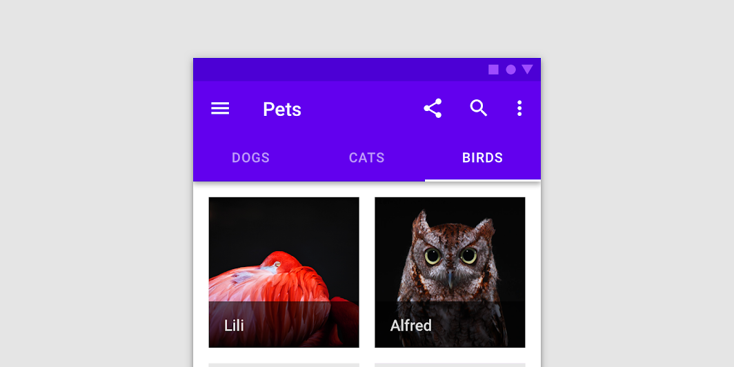
TabRow
Common
Fixed tabs display all tabs in a set simultaneously. They are best for switching between related content quickly, such as between transportation methods in a map. To navigate between fixed tabs, tap an individual tab, or swipe left or right in the content area.
Last updated:
Installation
dependencies {
   implementation("androidx.compose.material:material:1.7.0-beta04")
}
Overloads
@UiComposable
@Composable
fun TabRow(
    selectedTabIndex: Int,
    modifier: Modifier = Modifier,
    backgroundColor: Color = MaterialTheme.colors.primarySurface,
    contentColor: Color = contentColorFor(backgroundColor),
    indicator: @Composable @UiComposable
        (tabPositions: List<TabPosition>) -> Unit = @Composable { tabPositions ->
        TabRowDefaults.Indicator(
            Modifier.tabIndicatorOffset(tabPositions[selectedTabIndex])
        )
    },
    divider: @Composable @UiComposable () -> Unit =
        @Composable {
            TabRowDefaults.Divider()
        },
    tabs: @Composable @UiComposable () -> Unit
)
Parameters
| name | description |
|---|---|
selectedTabIndex | the index of the currently selected tab |
modifier | optional [Modifier] for this TabRow |
backgroundColor | The background color for the TabRow. Use [Color.Transparent] to have no color. |
contentColor | The preferred content color provided by this TabRow to its children. Defaults to either the matching content color for [backgroundColor], or if [backgroundColor] is not a color from the theme, this will keep the same value set above this TabRow. |
indicator | the indicator that represents which tab is currently selected. By default this will be a [TabRowDefaults.Indicator], using a [TabRowDefaults.tabIndicatorOffset] modifier to animate its position. Note that this indicator will be forced to fill up the entire TabRow, so you should use [TabRowDefaults.tabIndicatorOffset] or similar to animate the actual drawn indicator inside this space, and provide an offset from the start. |
divider | the divider displayed at the bottom of the TabRow. This provides a layer of separation between the TabRow and the content displayed underneath. |
tabs | the tabs inside this TabRow. Typically this will be multiple [Tab]s. Each element inside this lambda will be measured and placed evenly across the TabRow, each taking up equal space. |
Code Examples
TextTabs
@Composable
@Sampled
fun TextTabs() {
    var state by remember { mutableStateOf(0) }
    val titles = listOf("TAB 1", "TAB 2", "TAB 3 WITH LOTS OF TEXT")
    Column {
        TabRow(selectedTabIndex = state) {
            titles.forEachIndexed { index, title ->
                Tab(
                    text = { Text(title) },
                    selected = state == index,
                    onClick = { state = index }
                )
            }
        }
        Text(
            modifier = Modifier.align(Alignment.CenterHorizontally),
            text = "Text tab ${state + 1} selected",
            style = MaterialTheme.typography.body1
        )
    }
}
FancyTabs
@Composable
@Sampled
fun FancyTabs() {
    var state by remember { mutableStateOf(0) }
    val titles = listOf("TAB 1", "TAB 2", "TAB 3")
    Column {
        TabRow(selectedTabIndex = state) {
            titles.forEachIndexed { index, title ->
                FancyTab(title = title, onClick = { state = index }, selected = (index == state))
            }
        }
        Text(
            modifier = Modifier.align(Alignment.CenterHorizontally),
            text = "Fancy tab ${state + 1} selected",
            style = MaterialTheme.typography.body1
        )
    }
}
FancyTab
@Composable
@Sampled
fun FancyTab(title: String, onClick: () -> Unit, selected: Boolean) {
    Tab(selected, onClick) {
        Column(
            Modifier.padding(10.dp).height(50.dp).fillMaxWidth(),
            verticalArrangement = Arrangement.SpaceBetween
        ) {
            Box(
                Modifier.size(10.dp)
                    .align(Alignment.CenterHorizontally)
                    .background(color = if (selected) Color.Red else Color.White)
            )
            Text(
                text = title,
                style = MaterialTheme.typography.body1,
                modifier = Modifier.align(Alignment.CenterHorizontally)
            )
        }
    }
}
FancyIndicator
@Composable
@Sampled
fun FancyIndicator(color: Color, modifier: Modifier = Modifier) {
    // Draws a rounded rectangular with border around the Tab, with a 5.dp padding from the edges
    // Color is passed in as a parameter [color]
    Box(
        modifier
            .padding(5.dp)
            .fillMaxSize()
            .border(BorderStroke(2.dp, color), RoundedCornerShape(5.dp))
    )
}
FancyIndicatorTabs
@Composable
@Sampled
fun FancyIndicatorTabs() {
    var state by remember { mutableStateOf(0) }
    val titles = listOf("TAB 1", "TAB 2", "TAB 3")

    // Reuse the default offset animation modifier, but use our own indicator
    val indicator = @Composable { tabPositions: List<TabPosition> ->
        FancyIndicator(Color.White, Modifier.tabIndicatorOffset(tabPositions[state]))
    }

    Column {
        TabRow(
            selectedTabIndex = state,
            indicator = indicator
        ) {
            titles.forEachIndexed { index, title ->
                Tab(
                    text = { Text(title) },
                    selected = state == index,
                    onClick = { state = index }
                )
            }
        }
        Text(
            modifier = Modifier.align(Alignment.CenterHorizontally),
            text = "Fancy indicator tab ${state + 1} selected",
            style = MaterialTheme.typography.body1
        )
    }
}
FancyAnimatedIndicator
@Composable
@Sampled
fun FancyAnimatedIndicator(tabPositions: List<TabPosition>, selectedTabIndex: Int) {
    val colors = listOf(Color.Yellow, Color.Red, Color.Green)
    val transition = updateTransition(selectedTabIndex)
    val indicatorStart by transition.animateDp(
        transitionSpec = {
            // Handle directionality here, if we are moving to the right, we
            // want the right side of the indicator to move faster, if we are
            // moving to the left, we want the left side to move faster.
            if (initialState < targetState) {
                spring(dampingRatio = 1f, stiffness = 50f)
            } else {
                spring(dampingRatio = 1f, stiffness = 1000f)
            }
        }
    ) {
        tabPositions[it].left
    }

    val indicatorEnd by transition.animateDp(
        transitionSpec = {
            // Handle directionality here, if we are moving to the right, we
            // want the right side of the indicator to move faster, if we are
            // moving to the left, we want the left side to move faster.
            if (initialState < targetState) {
                spring(dampingRatio = 1f, stiffness = 1000f)
            } else {
                spring(dampingRatio = 1f, stiffness = 50f)
            }
        }
    ) {
        tabPositions[it].right
    }

    val indicatorColor by transition.animateColor {
        colors[it % colors.size]
    }

    FancyIndicator(
        // Pass the current color to the indicator
        indicatorColor,
        modifier = Modifier
            // Fill up the entire TabRow, and place the indicator at the start
            .fillMaxSize()
            .wrapContentSize(align = Alignment.BottomStart)
            // Apply an offset from the start to correctly position the indicator around the tab
            .offset(x = indicatorStart)
            // Make the width of the indicator follow the animated width as we move between tabs
            .width(indicatorEnd - indicatorStart)
    )
}
FancyIndicatorContainerTabs
@Composable
@Sampled
fun FancyIndicatorContainerTabs() {
    var state by remember { mutableStateOf(0) }
    val titles = listOf("TAB 1", "TAB 2", "TAB 3")

    val indicator = @Composable { tabPositions: List<TabPosition> ->
        FancyAnimatedIndicator(tabPositions = tabPositions, selectedTabIndex = state)
    }

    Column {
        TabRow(
            selectedTabIndex = state,
            indicator = indicator
        ) {
            titles.forEachIndexed { index, title ->
                Tab(
                    text = { Text(title) },
                    selected = state == index,
                    onClick = { state = index }
                )
            }
        }
        Text(
            modifier = Modifier.align(Alignment.CenterHorizontally),
            text = "Fancy transition tab ${state + 1} selected",
            style = MaterialTheme.typography.body1
        )
    }
}
