
← Compose Multiplatform Component in Material Compose
TopAppBar
Common
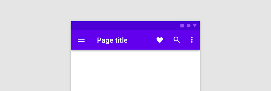
The top app bar displays information and actions relating to the current screen.
Last updated:
Installation
dependencies {
   implementation("androidx.compose.material:material:1.7.0-beta04")
}
Overloads
@Composable
fun TopAppBar(
    title: @Composable () -> Unit,
    windowInsets: WindowInsets,
    modifier: Modifier = Modifier,
    navigationIcon: @Composable (() -> Unit)? = null,
    actions: @Composable RowScope.() -> Unit = {},
    backgroundColor: Color = MaterialTheme.colors.primarySurface,
    contentColor: Color = contentColorFor(backgroundColor),
    elevation: Dp = AppBarDefaults.TopAppBarElevation,
)
Parameters
| name | description |
|---|---|
title | The title to be displayed in the center of the TopAppBar |
windowInsets | a window insets that app bar will respect. |
modifier | The [Modifier] to be applied to this TopAppBar |
navigationIcon | The navigation icon displayed at the start of the TopAppBar. This should typically be an [IconButton] or [IconToggleButton]. |
actions | The actions displayed at the end of the TopAppBar. This should typically be [IconButton]s. The default layout here is a [Row], so icons inside will be placed horizontally. |
backgroundColor | The background color for the TopAppBar. Use [Color.Transparent] to have no color. |
contentColor | The preferred content color provided by this TopAppBar to its children. Defaults to either the matching content color for [backgroundColor], or if [backgroundColor] is not a color from the theme, this will keep the same value set above this TopAppBar. |
elevation | the elevation of this TopAppBar. |
@Composable
fun TopAppBar(
    title: @Composable () -> Unit,
    modifier: Modifier = Modifier,
    navigationIcon: @Composable (() -> Unit)? = null,
    actions: @Composable RowScope.() -> Unit = {},
    backgroundColor: Color = MaterialTheme.colors.primarySurface,
    contentColor: Color = contentColorFor(backgroundColor),
    elevation: Dp = AppBarDefaults.TopAppBarElevation
)
Parameters
| name | description |
|---|---|
title | The title to be displayed in the center of the TopAppBar |
modifier | The [Modifier] to be applied to this TopAppBar |
navigationIcon | The navigation icon displayed at the start of the TopAppBar. This should typically be an [IconButton] or [IconToggleButton]. |
actions | The actions displayed at the end of the TopAppBar. This should typically be [IconButton]s. The default layout here is a [Row], so icons inside will be placed horizontally. |
backgroundColor | The background color for the TopAppBar. Use [Color.Transparent] to have no color. |
contentColor | The preferred content color provided by this TopAppBar to its children. Defaults to either the matching content color for [backgroundColor], or if [backgroundColor] is not a color from the theme, this will keep the same value set above this TopAppBar. |
elevation | the elevation of this TopAppBar. |
@Composable
fun TopAppBar(
    windowInsets: WindowInsets,
    modifier: Modifier = Modifier,
    backgroundColor: Color = MaterialTheme.colors.primarySurface,
    contentColor: Color = contentColorFor(backgroundColor),
    elevation: Dp = AppBarDefaults.TopAppBarElevation,
    contentPadding: PaddingValues = AppBarDefaults.ContentPadding,
    content: @Composable RowScope.() -> Unit
)
Parameters
| name | description |
|---|---|
windowInsets | a window insets that app bar will respect. |
modifier | The [Modifier] to be applied to this TopAppBar |
backgroundColor | The background color for the TopAppBar. Use [Color.Transparent] to have no color. |
contentColor | The preferred content color provided by this TopAppBar to its children. Defaults to either the matching content color for [backgroundColor], or if [backgroundColor] is not a color from the theme, this will keep the same value set above this TopAppBar. |
elevation | the elevation of this TopAppBar. |
contentPadding | the padding applied to the content of this TopAppBar |
content | the content of this TopAppBar.The default layout here is a [Row], so content inside will be placed horizontally. |
@Composable
fun TopAppBar(
    modifier: Modifier = Modifier,
    backgroundColor: Color = MaterialTheme.colors.primarySurface,
    contentColor: Color = contentColorFor(backgroundColor),
    elevation: Dp = AppBarDefaults.TopAppBarElevation,
    contentPadding: PaddingValues = AppBarDefaults.ContentPadding,
    content: @Composable RowScope.() -> Unit
)
Parameters
| name | description |
|---|---|
modifier | The [Modifier] to be applied to this TopAppBar |
backgroundColor | The background color for the TopAppBar. Use [Color.Transparent] to have no color. |
contentColor | The preferred content color provided by this TopAppBar to its children. Defaults to either the matching content color for [backgroundColor], or if [backgroundColor] is not a color from the theme, this will keep the same value set above this TopAppBar. |
elevation | the elevation of this TopAppBar. |
contentPadding | the padding applied to the content of this TopAppBar |
content | the content of this TopAppBar.The default layout here is a [Row], so content inside will be placed horizontally. |
Code Example
SimpleTopAppBar
@Composable
@Sampled
fun SimpleTopAppBar() {
    TopAppBar(
        windowInsets = AppBarDefaults.topAppBarWindowInsets,
        title = { Text("Simple TopAppBar") },
        navigationIcon = {
            IconButton(onClick = { /* doSomething() */ }) {
                Icon(Icons.Filled.Menu, contentDescription = null)
            }
        },
        actions = {
            // RowScope here, so these icons will be placed horizontally
            IconButton(onClick = { /* doSomething() */ }) {
                Icon(Icons.Filled.Favorite, contentDescription = "Localized description")
            }
            IconButton(onClick = { /* doSomething() */ }) {
                Icon(Icons.Filled.Favorite, contentDescription = "Localized description")
            }
        }
    )
}
