
← Compose Multiplatform Component in Material Compose
TriStateCheckbox
Common
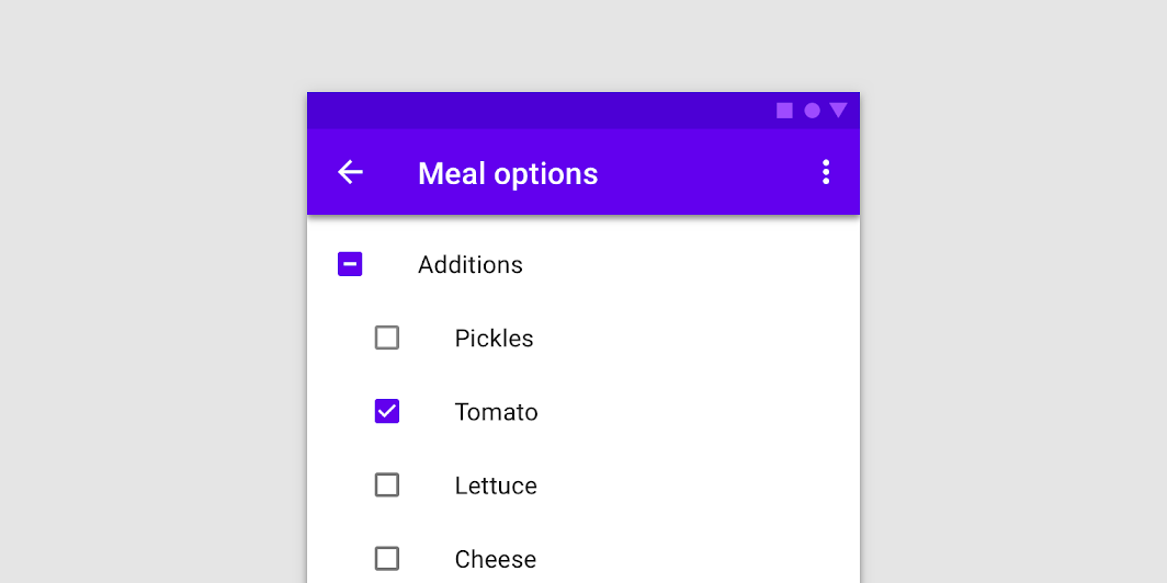
Checkboxes can have a parent-child relationship with other checkboxes. When the parent checkbox is checked, all child checkboxes are checked. If a parent checkbox is unchecked, all child checkboxes are unchecked. If some, but not all, child checkboxes are checked, the parent checkbox becomes an indeterminate checkbox.
Last updated:
Installation
dependencies {
   implementation("androidx.compose.material:material:1.7.0-beta04")
}
Overloads
@Composable
fun TriStateCheckbox(
    state: ToggleableState,
    onClick: (() -> Unit)?,
    modifier: Modifier = Modifier,
    enabled: Boolean = true,
    interactionSource: MutableInteractionSource? = null,
    colors: CheckboxColors = CheckboxDefaults.colors()
)
Parameters
| name | description |
|---|---|
state | whether TriStateCheckbox is checked, unchecked or in indeterminate state |
onClick | callback to be invoked when checkbox is being clicked, therefore the change of ToggleableState state is requested. If null, then this is passive and relies entirely on a higher-level component to control the state. |
modifier | Modifier to be applied to the layout of the checkbox |
enabled | whether the component is enabled or grayed out |
interactionSource | an optional hoisted [MutableInteractionSource] for observing and emitting [Interaction]s for this checkbox. You can use this to change the checkbox's appearance or preview the checkbox in different states. Note that if null is provided, interactions will still happen internally. |
colors | [CheckboxColors] that will be used to determine the color of the checkmark / box / border in different states. See [CheckboxDefaults.colors]. |
Code Example
TriStateCheckboxSample
@Composable
@Sampled
fun TriStateCheckboxSample() {
    Column {
        // define dependent checkboxes states
        val (state, onStateChange) = remember { mutableStateOf(true) }
        val (state2, onStateChange2) = remember { mutableStateOf(true) }

        // TriStateCheckbox state reflects state of dependent checkboxes
        val parentState = remember(state, state2) {
            if (state && state2) ToggleableState.On
            else if (!state && !state2) ToggleableState.Off
            else ToggleableState.Indeterminate
        }
        // click on TriStateCheckbox can set state for dependent checkboxes
        val onParentClick = {
            val s = parentState != ToggleableState.On
            onStateChange(s)
            onStateChange2(s)
        }

        TriStateCheckbox(
            state = parentState,
            onClick = onParentClick,
            colors = CheckboxDefaults.colors(
                checkedColor = MaterialTheme.colors.primary
            )
        )
        Spacer(Modifier.size(25.dp))
        Column(Modifier.padding(10.dp, 0.dp, 0.dp, 0.dp)) {
            Checkbox(state, onStateChange)
            Spacer(Modifier.size(25.dp))
            Checkbox(state2, onStateChange2)
        }
    }
}
