
← Compose Multiplatform Component in Material 3 Compose
AlertDialog
Common
Android
Dialogs provide important prompts in a user flow. They can require an action, communicate information, or help users accomplish a task.
Last updated:
Installation
dependencies {
   implementation("androidx.compose.material3:material3:1.3.0-beta04")
}
Overloads
@Composable
fun AlertDialog(
    onDismissRequest: () -> Unit,
    confirmButton: @Composable () -> Unit,
    modifier: Modifier = Modifier,
    dismissButton: @Composable (() -> Unit)? = null,
    icon: @Composable (() -> Unit)? = null,
    title: @Composable (() -> Unit)? = null,
    text: @Composable (() -> Unit)? = null,
    shape: Shape = AlertDialogDefaults.shape,
    containerColor: Color = AlertDialogDefaults.containerColor,
    iconContentColor: Color = AlertDialogDefaults.iconContentColor,
    titleContentColor: Color = AlertDialogDefaults.titleContentColor,
    textContentColor: Color = AlertDialogDefaults.textContentColor,
    tonalElevation: Dp = AlertDialogDefaults.TonalElevation,
    properties: DialogProperties = DialogProperties()
)
Parameters
| name | description |
|---|---|
onDismissRequest | called when the user tries to dismiss the Dialog by clicking outside or pressing the back button. This is not called when the dismiss button is clicked. |
confirmButton | button which is meant to confirm a proposed action, thus resolving what triggered the dialog. The dialog does not set up any events for this button so they need to be set up by the caller. |
modifier | the [Modifier] to be applied to this dialog |
dismissButton | button which is meant to dismiss the dialog. The dialog does not set up any events for this button so they need to be set up by the caller. |
icon | optional icon that will appear above the [title] or above the [text], in case a title was not provided. |
title | title which should specify the purpose of the dialog. The title is not mandatory, because there may be sufficient information inside the [text]. |
text | text which presents the details regarding the dialog's purpose. |
shape | defines the shape of this dialog's container |
containerColor | the color used for the background of this dialog. Use [Color.Transparent] to have no color. |
iconContentColor | the content color used for the icon. |
titleContentColor | the content color used for the title. |
textContentColor | the content color used for the text. |
tonalElevation | when [containerColor] is [ColorScheme.surface], a translucent primary color overlay is applied on top of the container. A higher tonal elevation value will result in a darker color in light theme and lighter color in dark theme. See also: [Surface]. |
properties | typically platform specific properties to further configure the dialog. @see BasicAlertDialog |
@Composable
@ExperimentalMaterial3Api
@Deprecated(
    "Use BasicAlertDialog instead",
    replaceWith = ReplaceWith("BasicAlertDialog(onDismissRequest, modifier, properties, content)")

fun AlertDialog(
    onDismissRequest: () -> Unit,
    modifier: Modifier = Modifier,
    properties: DialogProperties = DialogProperties(),
    content: @Composable () -> Unit
)
Parameters
| name | description |
|---|---|
onDismissRequest | called when the user tries to dismiss the Dialog by clicking outside or pressing the back button. This is not called when the dismiss button is clicked. |
modifier | the [Modifier] to be applied to this dialog's content. |
properties | typically platform specific properties to further configure the dialog. |
content | the content of the dialog |
@Composable
fun AlertDialog(
    onDismissRequest: () -> Unit,
    confirmButton: @Composable () -> Unit,
    modifier: Modifier,
    dismissButton: @Composable (() -> Unit)?,
    icon: @Composable (() -> Unit)?,
    title: @Composable (() -> Unit)?,
    text: @Composable (() -> Unit)?,
    shape: Shape,
    containerColor: Color,
    iconContentColor: Color,
    titleContentColor: Color,
    textContentColor: Color,
    tonalElevation: Dp,
    properties: DialogProperties
)
Code Examples
AlertDialogSample
@Composable
@Sampled
@Preview
fun AlertDialogSample() {
    val openDialog = remember { mutableStateOf(true) }

    if (openDialog.value) {
        AlertDialog(
            onDismissRequest = {
                // Dismiss the dialog when the user clicks outside the dialog or on the back
                // button. If you want to disable that functionality, simply use an empty
                // onDismissRequest.
                openDialog.value = false
            },
            title = { Text(text = "Title") },
            text = { Text(text = "Turned on by default") },
            confirmButton = {
                TextButton(onClick = { openDialog.value = false }) { Text("Confirm") }
            },
            dismissButton = {
                TextButton(onClick = { openDialog.value = false }) { Text("Dismiss") }
            }
        )
    }
}
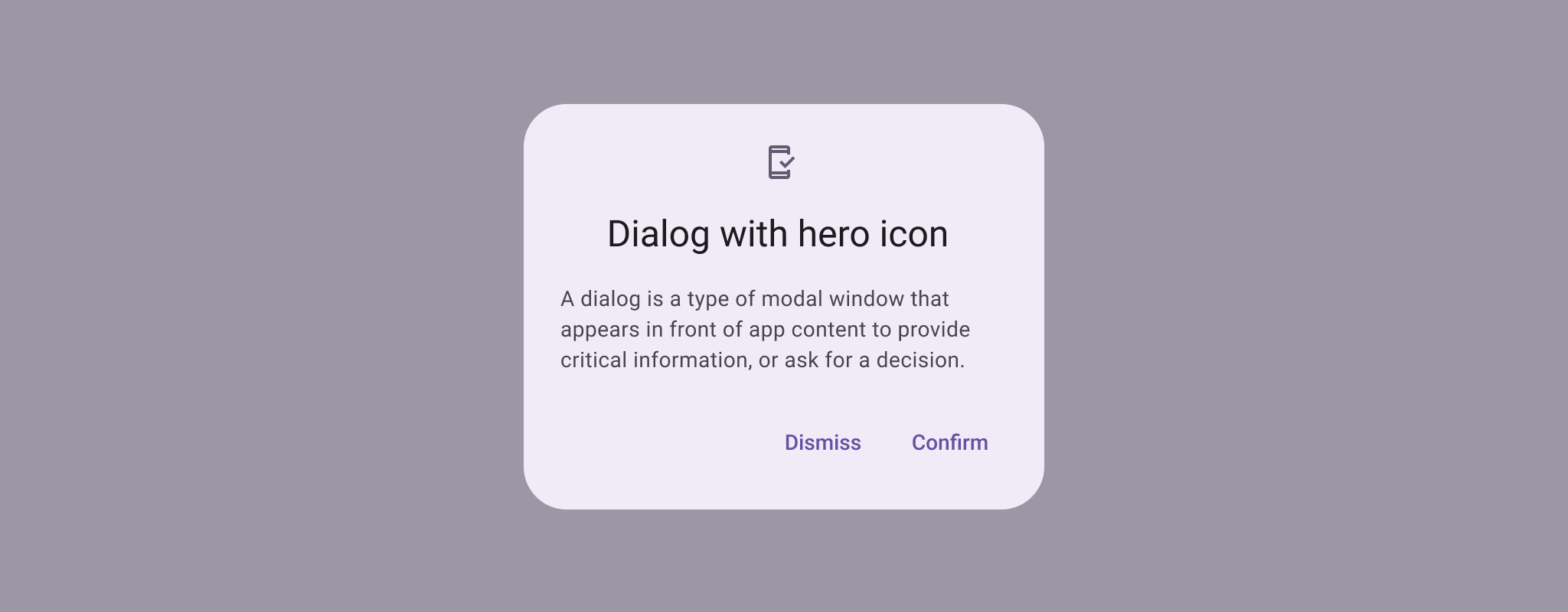
AlertDialogWithIconSample
@Composable
@Sampled
@Preview
fun AlertDialogWithIconSample() {
    val openDialog = remember { mutableStateOf(true) }

    if (openDialog.value) {
        AlertDialog(
            onDismissRequest = {
                // Dismiss the dialog when the user clicks outside the dialog or on the back
                // button. If you want to disable that functionality, simply use an empty
                // onDismissRequest.
                openDialog.value = false
            },
            icon = { Icon(Icons.Filled.Favorite, contentDescription = null) },
            title = { Text(text = "Title") },
            text = {
                Text(
                    "This area typically contains the supportive text " +
                        "which presents the details regarding the Dialog's purpose."
                )
            },
            confirmButton = {
                TextButton(onClick = { openDialog.value = false }) { Text("Confirm") }
            },
            dismissButton = {
                TextButton(onClick = { openDialog.value = false }) { Text("Dismiss") }
            }
        )
    }
}
BasicAlertDialogSample
@Composable
@OptIn(ExperimentalMaterial3Api::class
@Sampled
@Preview
fun BasicAlertDialogSample() {
    val openDialog = remember { mutableStateOf(true) }

    if (openDialog.value) {
        BasicAlertDialog(
            onDismissRequest = {
                // Dismiss the dialog when the user clicks outside the dialog or on the back
                // button. If you want to disable that functionality, simply use an empty
                // onDismissRequest.
                openDialog.value = false
            }
        ) {
            Surface(
                modifier = Modifier.wrapContentWidth().wrapContentHeight(),
                shape = MaterialTheme.shapes.large,
                tonalElevation = AlertDialogDefaults.TonalElevation
            ) {
                Column(modifier = Modifier.padding(16.dp)) {
                    Text(
                        text =
                            "This area typically contains the supportive text " +
                                "which presents the details regarding the Dialog's purpose.",
                    )
                    Spacer(modifier = Modifier.height(24.dp))
                    TextButton(
                        onClick = { openDialog.value = false },
                        modifier = Modifier.align(Alignment.End)
                    ) {
                        Text("Confirm")
                    }
                }
            }
        }
    }
}
