
← Compose Multiplatform Component in Material 3 Compose
BadgedBox
Common
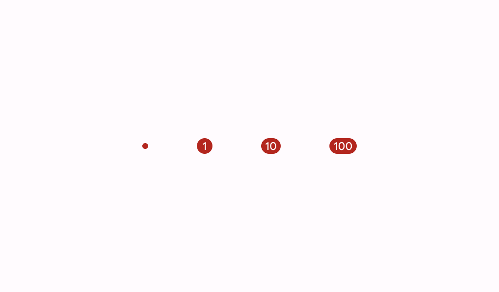
Material Design badge box.
A badge represents dynamic information such as a number of pending requests in a navigation bar.
Badges can be icon only or contain short text.
Last updated:
Installation
dependencies {
   implementation("androidx.compose.material3:material3:1.3.0-beta04")
}
Overloads
@Composable
fun BadgedBox(
    badge: @Composable BoxScope.() -> Unit,
    modifier: Modifier = Modifier,
    content: @Composable BoxScope.() -> Unit,
)
Parameters
| name | description |
|---|---|
badge | the badge to be displayed - typically a [Badge] |
modifier | the [Modifier] to be applied to this BadgedBox |
content | the anchor to which this badge will be positioned |
Code Example
NavigationBarItemWithBadge
@Composable
@Sampled
@Preview
fun NavigationBarItemWithBadge() {
    NavigationBar {
        NavigationBarItem(
            icon = {
                BadgedBox(
                    badge = {
                        Badge {
                            val badgeNumber = "8"
                            Text(
                                badgeNumber,
                                modifier =
                                    Modifier.semantics {
                                        contentDescription = "$badgeNumber new notifications"
                                    }
                            )
                        }
                    }
                ) {
                    Icon(Icons.Filled.Star, contentDescription = "Favorite")
                }
            },
            selected = false,
            onClick = {}
        )
    }
}
