
← Compose Multiplatform Component in Material 3 Compose
BasicAlertDialog
Common
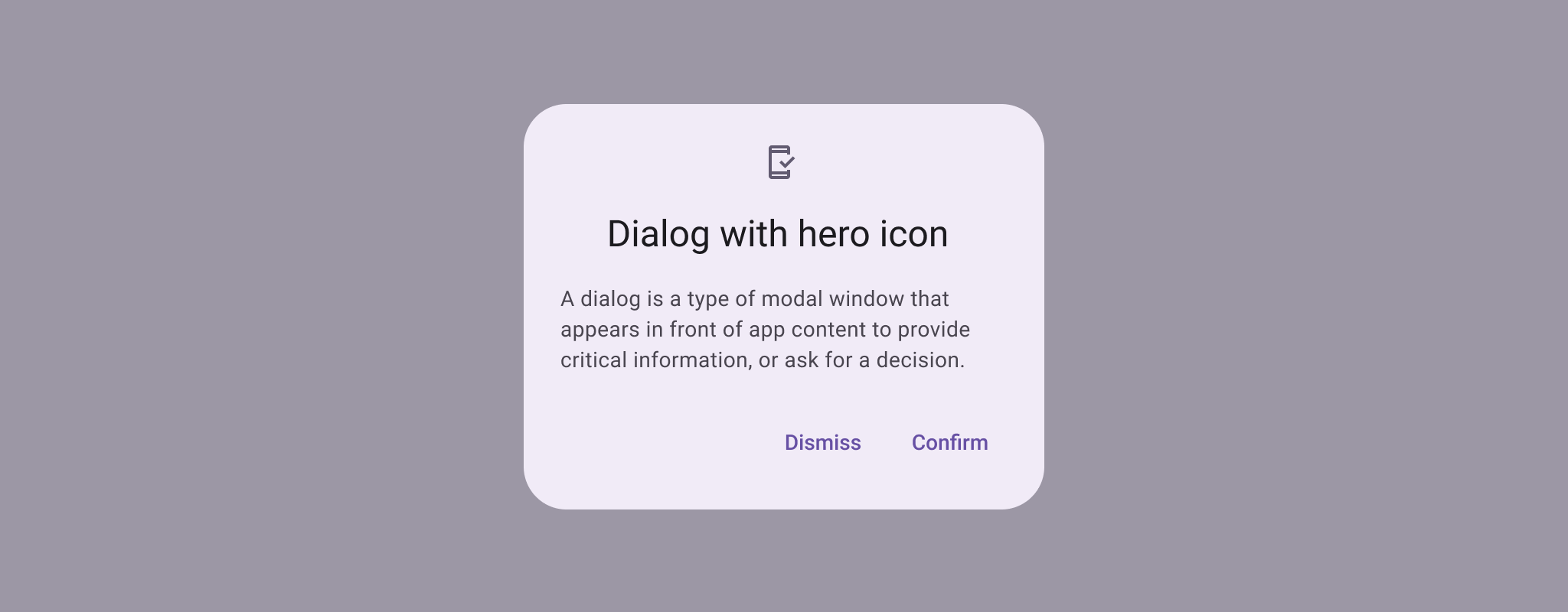
Dialogs provide important prompts in a user flow. They can require an action, communicate information, or help users accomplish a task.
Last updated:
Installation
dependencies {
   implementation("androidx.compose.material3:material3:1.3.0-beta04")
}
Overloads
@Composable
@ExperimentalMaterial3Api
fun BasicAlertDialog(
    onDismissRequest: () -> Unit,
    modifier: Modifier = Modifier,
    properties: DialogProperties = DialogProperties(),
    content: @Composable () -> Unit
)
Parameters
| name | description |
|---|---|
onDismissRequest | called when the user tries to dismiss the Dialog by clicking outside or pressing the back button. This is not called when the dismiss button is clicked. |
modifier | the [Modifier] to be applied to this dialog's content. |
properties | typically platform specific properties to further configure the dialog. |
content | the content of the dialog |
Code Example
BasicAlertDialogSample
@Composable
@OptIn(ExperimentalMaterial3Api::class
@Sampled
@Preview
fun BasicAlertDialogSample() {
    val openDialog = remember { mutableStateOf(true) }

    if (openDialog.value) {
        BasicAlertDialog(
            onDismissRequest = {
                // Dismiss the dialog when the user clicks outside the dialog or on the back
                // button. If you want to disable that functionality, simply use an empty
                // onDismissRequest.
                openDialog.value = false
            }
        ) {
            Surface(
                modifier = Modifier.wrapContentWidth().wrapContentHeight(),
                shape = MaterialTheme.shapes.large,
                tonalElevation = AlertDialogDefaults.TonalElevation
            ) {
                Column(modifier = Modifier.padding(16.dp)) {
                    Text(
                        text =
                            "This area typically contains the supportive text " +
                                "which presents the details regarding the Dialog's purpose.",
                    )
                    Spacer(modifier = Modifier.height(24.dp))
                    TextButton(
                        onClick = { openDialog.value = false },
                        modifier = Modifier.align(Alignment.End)
                    ) {
                        Text("Confirm")
                    }
                }
            }
        }
    }
}
