← Compose Multiplatform Component in Material 3 Compose
BottomSheetScaffold
Common
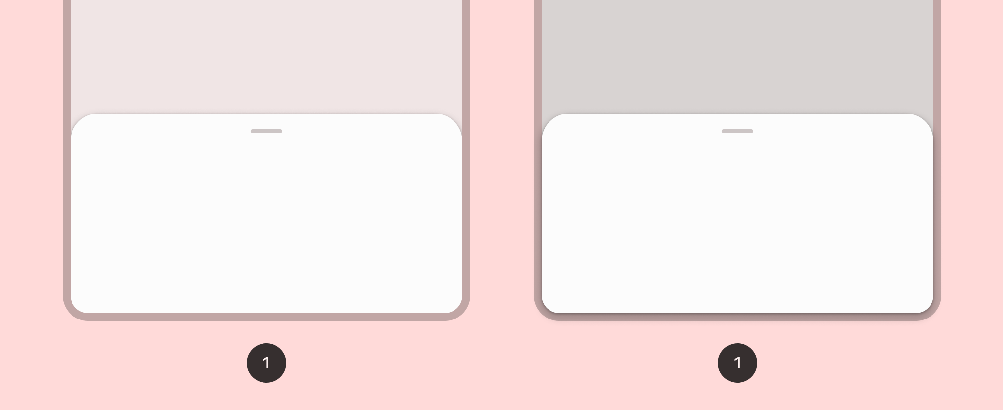
Standard bottom sheets co-exist with the screen’s main UI region and allow for simultaneously viewing and interacting with both regions. They are commonly used to keep a feature or secondary content visible on screen when content in main UI region is frequently scrolled or panned.

Last updated:
Installation
dependencies {
   implementation("androidx.compose.material3:material3:1.3.0-beta04")
}
Overloads
@ExperimentalMaterial3Api
@Composable
fun BottomSheetScaffold(
    sheetContent: @Composable ColumnScope.() -> Unit,
    modifier: Modifier = Modifier,
    scaffoldState: BottomSheetScaffoldState = rememberBottomSheetScaffoldState(),
    sheetPeekHeight: Dp = BottomSheetDefaults.SheetPeekHeight,
    sheetMaxWidth: Dp = BottomSheetDefaults.SheetMaxWidth,
    sheetShape: Shape = BottomSheetDefaults.ExpandedShape,
    sheetContainerColor: Color = BottomSheetDefaults.ContainerColor,
    sheetContentColor: Color = contentColorFor(sheetContainerColor),
    sheetTonalElevation: Dp = 0.dp,
    sheetShadowElevation: Dp = BottomSheetDefaults.Elevation,
    sheetDragHandle: @Composable (() -> Unit)? = { BottomSheetDefaults.DragHandle() },
    sheetSwipeEnabled: Boolean = true,
    topBar: @Composable (() -> Unit)? = null,
    snackbarHost: @Composable (SnackbarHostState) -> Unit = { SnackbarHost(it) },
    containerColor: Color = MaterialTheme.colorScheme.surface,
    contentColor: Color = contentColorFor(containerColor),
    content: @Composable (PaddingValues) -> Unit
)
Parameters
| name | description |
|---|---|
sheetContent | the content of the bottom sheet |
modifier | the [Modifier] to be applied to this scaffold |
scaffoldState | the state of the bottom sheet scaffold |
sheetPeekHeight | the height of the bottom sheet when it is collapsed |
sheetMaxWidth | [Dp] that defines what the maximum width the sheet will take. Pass in [Dp.Unspecified] for a sheet that spans the entire screen width. |
sheetShape | the shape of the bottom sheet |
sheetContainerColor | the background color of the bottom sheet |
sheetContentColor | the preferred content color provided by the bottom sheet to its children. Defaults to the matching content color for [sheetContainerColor], or if that is not a color from the theme, this will keep the same content color set above the bottom sheet. |
sheetTonalElevation | when [sheetContainerColor] is [ColorScheme.surface], a translucent primary color overlay is applied on top of the container. A higher tonal elevation value will result in a darker color in light theme and lighter color in dark theme. See also: [Surface]. |
sheetShadowElevation | the shadow elevation of the bottom sheet |
sheetDragHandle | optional visual marker to pull the scaffold's bottom sheet |
sheetSwipeEnabled | whether the sheet swiping is enabled and should react to the user's input |
topBar | top app bar of the screen, typically a [SmallTopAppBar] |
snackbarHost | component to host [Snackbar]s that are pushed to be shown via [SnackbarHostState.showSnackbar], typically a [SnackbarHost] |
containerColor | the color used for the background of this scaffold. Use [Color.Transparent] to have no color. |
contentColor | the preferred color for content inside this scaffold. Defaults to either the matching content color for [containerColor], or to the current [LocalContentColor] if [containerColor] is not a color from the theme. |
content | content of the screen. The lambda receives a [PaddingValues] that should be applied to the content root via [Modifier.padding] and [Modifier.consumeWindowInsets] to properly offset top and bottom bars. If using [Modifier.verticalScroll], apply this modifier to the child of the scroll, and not on the scroll itself. |
Code Example
SimpleBottomSheetScaffoldSample
@Composable
@OptIn(ExperimentalMaterial3Api::class
@Sampled
@Preview
fun SimpleBottomSheetScaffoldSample() {
    val scope = rememberCoroutineScope()
    val scaffoldState = rememberBottomSheetScaffoldState()

    BottomSheetScaffold(
        scaffoldState = scaffoldState,
        sheetPeekHeight = 128.dp,
        sheetContent = {
            Column(Modifier.fillMaxWidth(), horizontalAlignment = Alignment.CenterHorizontally) {
                Box(Modifier.fillMaxWidth().height(128.dp), contentAlignment = Alignment.Center) {
                    Text("Swipe up to expand sheet")
                }
                Text("Sheet content")
                Button(
                    modifier = Modifier.padding(bottom = 64.dp),
                    onClick = { scope.launch { scaffoldState.bottomSheetState.partialExpand() } }
                ) {
                    Text("Click to collapse sheet")
                }
            }
        }
    ) { innerPadding ->
        Box(
            modifier = Modifier.fillMaxSize().padding(innerPadding),
            contentAlignment = Alignment.Center
        ) {
            Text("Scaffold Content")
        }
    }
}
