
← Compose Multiplatform Component in Material 3 Compose
Checkbox
Common
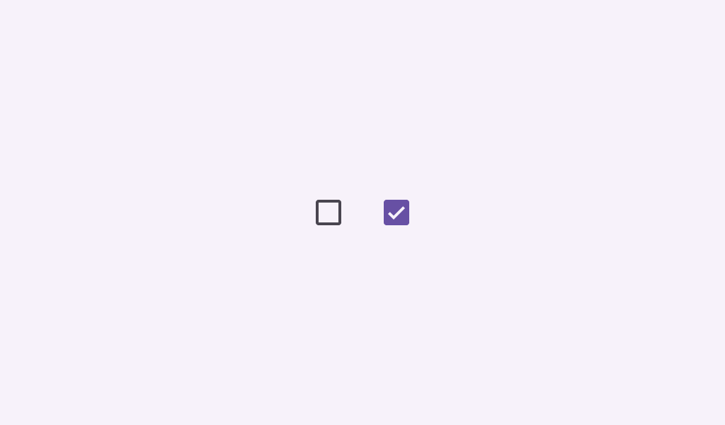
Checkboxes allow users to select one or more items from a set. Checkboxes can turn an option on or off.
Last updated:
Installation
dependencies {
   implementation("androidx.compose.material3:material3:1.3.0-beta04")
}
Overloads
@Composable
fun Checkbox(
    checked: Boolean,
    onCheckedChange: ((Boolean) -> Unit)?,
    modifier: Modifier = Modifier,
    enabled: Boolean = true,
    colors: CheckboxColors = CheckboxDefaults.colors(),
    interactionSource: MutableInteractionSource? = null
)
Parameters
| name | description |
|---|---|
checked | whether this checkbox is checked or unchecked |
onCheckedChange | called when this checkbox is clicked. If null, then this checkbox will not be interactable, unless something else handles its input events and updates its state. |
modifier | the [Modifier] to be applied to this checkbox |
enabled | controls the enabled state of this checkbox. When false, this component will not respond to user input, and it will appear visually disabled and disabled to accessibility services. |
colors | [CheckboxColors] that will be used to resolve the colors used for this checkbox in different states. See [CheckboxDefaults.colors]. |
interactionSource | an optional hoisted [MutableInteractionSource] for observing and emitting [Interaction]s for this checkbox. You can use this to change the checkbox's appearance or preview the checkbox in different states. Note that if null is provided, interactions will still happen internally. @see [TriStateCheckbox] if you require support for an indeterminate state. |
Code Examples
CheckboxSample
@Composable
@Sampled
@Preview
fun CheckboxSample() {
    val checkedState = remember { mutableStateOf(true) }
    Checkbox(checked = checkedState.value, onCheckedChange = { checkedState.value = it })
}
CheckboxWithTextSample
@Composable
@Sampled
@Preview
fun CheckboxWithTextSample() {
    val (checkedState, onStateChange) = remember { mutableStateOf(true) }
    Row(
        Modifier.fillMaxWidth()
            .height(56.dp)
            .toggleable(
                value = checkedState,
                onValueChange = { onStateChange(!checkedState) },
                role = Role.Checkbox
            )
            .padding(horizontal = 16.dp),
        verticalAlignment = Alignment.CenterVertically
    ) {
        Checkbox(
            checked = checkedState,
            onCheckedChange = null // null recommended for accessibility with screenreaders
        )
        Text(
            text = "Option selection",
            style = MaterialTheme.typography.bodyLarge,
            modifier = Modifier.padding(start = 16.dp)
        )
    }
}
