
← Compose Multiplatform Component in Material 3 Compose
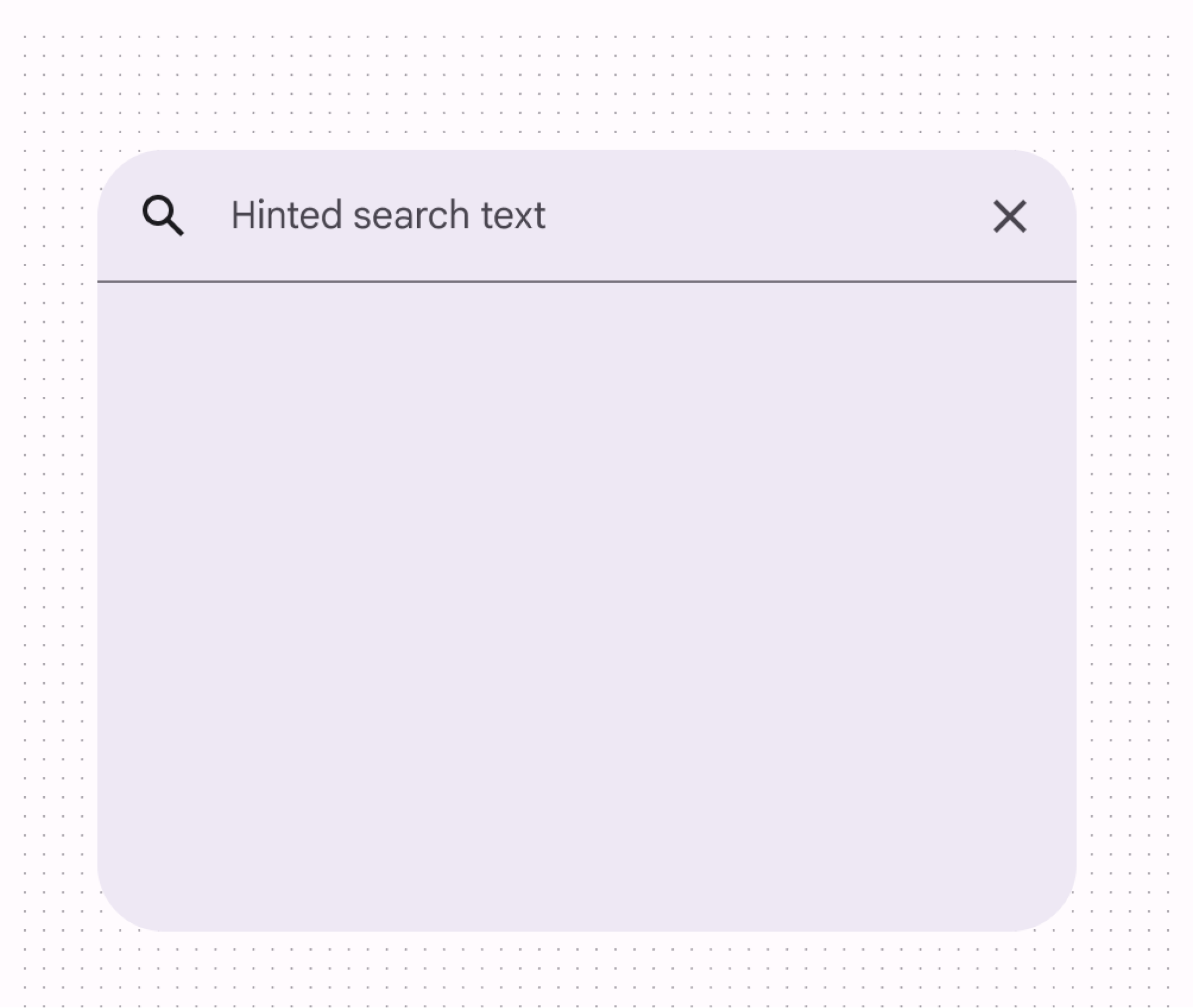
DockedSearchBar
Android
A search bar represents a floating search field that allows users to enter a keyword or phrase and get relevant information. It can be used as a way to navigate through an app via search queries.
An search bar expands into a search "view" and can be used to display dynamic suggestions or search results.
Last updated:
Installation
dependencies {
   implementation("androidx.compose.material3:material3:1.3.0-beta04")
}
Overloads
@Composable
@ExperimentalMaterial3Api
fun DockedSearchBar(
    inputField: @Composable () -> Unit,
    expanded: Boolean,
    onExpandedChange: (Boolean) -> Unit,
    modifier: Modifier = Modifier,
    shape: Shape = SearchBarDefaults.dockedShape,
    colors: SearchBarColors = SearchBarDefaults.colors(),
    tonalElevation: Dp = SearchBarDefaults.TonalElevation,
    shadowElevation: Dp = SearchBarDefaults.ShadowElevation,
    content: @Composable ColumnScope.() -> Unit,
)
Parameters
| name | description |
|---|---|
inputField | the input field of this search bar that allows entering a query, typically a [SearchBarDefaults.InputField]. |
expanded | whether this search bar is expanded and showing search results. |
onExpandedChange | the callback to be invoked when this search bar's expanded state is changed. |
modifier | the [Modifier] to be applied to this search bar. |
shape | the shape of this search bar. |
colors | [SearchBarColors] that will be used to resolve the colors used for this search bar in different states. See [SearchBarDefaults.colors]. |
tonalElevation | when [SearchBarColors.containerColor] is [ColorScheme.surface], a translucent primary color overlay is applied on top of the container. A higher tonal elevation value will result in a darker color in light theme and lighter color in dark theme. See also: [Surface]. |
shadowElevation | the elevation for the shadow below the search bar. |
content | the content of this search bar to display search results below the [inputField]. |
@Composable
@ExperimentalMaterial3Api
@Deprecated(
    message = "Use overload which takes inputField as a parameter",
    replaceWith =
        ReplaceWith(
            "DockedSearchBar(\n" +
                "    inputField = {\n" +
                "        SearchBarDefaults.InputField(\n" +
                "            query = query,\n" +
                "            onQueryChange = onQueryChange,\n" +
                "            onSearch = onSearch,\n" +
                "            expanded = active,\n" +
                "            onExpandedChange = onActiveChange,\n" +
                "            enabled = enabled,\n" +
                "            placeholder = placeholder,\n" +
                "            leadingIcon = leadingIcon,\n" +
                "            trailingIcon = trailingIcon,\n" +
                "            colors = colors.inputFieldColors,\n" +
                "            interactionSource = interactionSource,\n" +
                "        )\n" +
                "    },\n" +
                "    expanded = active,\n" +
                "    onExpandedChange = onActiveChange,\n" +
                "    modifier = modifier,\n" +
                "    shape = shape,\n" +
                "    colors = colors,\n" +
                "    tonalElevation = tonalElevation,\n" +
                "    shadowElevation = shadowElevation,\n" +
                "    content = content,\n" +
                ")"
        ),

@Suppress("DEPRECATION"
fun DockedSearchBar(
    query: String,
    onQueryChange: (String) -> Unit,
    onSearch: (String) -> Unit,
    active: Boolean,
    onActiveChange: (Boolean) -> Unit,
    modifier: Modifier = Modifier,
    enabled: Boolean = true,
    placeholder: @Composable (() -> Unit)? = null,
    leadingIcon: @Composable (() -> Unit)? = null,
    trailingIcon: @Composable (() -> Unit)? = null,
    shape: Shape = SearchBarDefaults.dockedShape,
    colors: SearchBarColors = SearchBarDefaults.colors(),
    tonalElevation: Dp = SearchBarDefaults.TonalElevation,
    shadowElevation: Dp = SearchBarDefaults.ShadowElevation,
    interactionSource: MutableInteractionSource? = null,
    content: @Composable ColumnScope.() -> Unit,
)
Code Example
DockedSearchBarSample
@Composable
@Sampled
@Preview
@OptIn(ExperimentalMaterial3Api::class
fun DockedSearchBarSample() {
    var text by rememberSaveable { mutableStateOf("") }
    var expanded by rememberSaveable { mutableStateOf(false) }

    Box(Modifier.fillMaxSize().semantics { isTraversalGroup = true }) {
        DockedSearchBar(
            modifier =
                Modifier.align(Alignment.TopCenter).padding(top = 8.dp).semantics {
                    traversalIndex = 0f
                },
            inputField = {
                SearchBarDefaults.InputField(
                    query = text,
                    onQueryChange = { text = it },
                    onSearch = { expanded = false },
                    expanded = expanded,
                    onExpandedChange = { expanded = it },
                    placeholder = { Text("Hinted search text") },
                    leadingIcon = { Icon(Icons.Default.Search, contentDescription = null) },
                    trailingIcon = { Icon(Icons.Default.MoreVert, contentDescription = null) },
                )
            },
            expanded = expanded,
            onExpandedChange = { expanded = it },
        ) {
            Column(Modifier.verticalScroll(rememberScrollState())) {
                repeat(4) { idx ->
                    val resultText = "Suggestion $idx"
                    ListItem(
                        headlineContent = { Text(resultText) },
                        supportingContent = { Text("Additional info") },
                        leadingContent = { Icon(Icons.Filled.Star, contentDescription = null) },
                        colors = ListItemDefaults.colors(containerColor = Color.Transparent),
                        modifier =
                            Modifier.clickable {
                                    text = resultText
                                    expanded = false
                                }
                                .fillMaxWidth()
                                .padding(horizontal = 16.dp, vertical = 4.dp)
                    )
                }
            }
        }

        LazyColumn(
            contentPadding = PaddingValues(start = 16.dp, top = 72.dp, end = 16.dp, bottom = 16.dp),
            verticalArrangement = Arrangement.spacedBy(8.dp),
            modifier = Modifier.semantics { traversalIndex = 1f },
        ) {
            val list = List(100) { "Text $it" }
            items(count = list.size) {
                Text(
                    text = list[it],
                    modifier = Modifier.fillMaxWidth().padding(horizontal = 16.dp),
                )
            }
        }
    }
}
