← Compose Multiplatform Component in Material 3 Compose
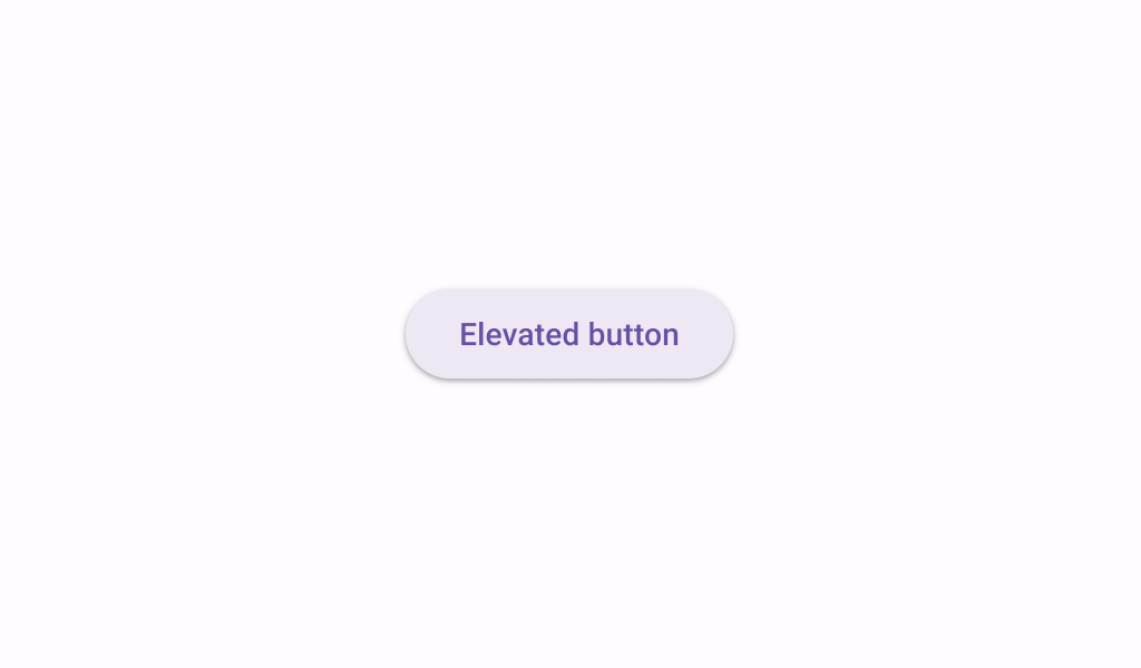
ElevatedButton
Common
Buttons help people initiate actions, from sending an email, to sharing a document, to liking a post.

Last updated:
Installation
dependencies {
   implementation("androidx.compose.material3:material3:1.3.0-beta04")
}
Overloads
@Composable
fun ElevatedButton(
    onClick: () -> Unit,
    modifier: Modifier = Modifier,
    enabled: Boolean = true,
    shape: Shape = ButtonDefaults.elevatedShape,
    colors: ButtonColors = ButtonDefaults.elevatedButtonColors(),
    elevation: ButtonElevation? = ButtonDefaults.elevatedButtonElevation(),
    border: BorderStroke? = null,
    contentPadding: PaddingValues = ButtonDefaults.ContentPadding,
    interactionSource: MutableInteractionSource? = null,
    content: @Composable RowScope.() -> Unit
)
Parameters
| name | description |
|---|---|
onClick | called when this button is clicked |
modifier | the [Modifier] to be applied to this button |
enabled | controls the enabled state of this button. When false, this component will not respond to user input, and it will appear visually disabled and disabled to accessibility services. |
shape | defines the shape of this button's container, border (when [border] is not null), and shadow (when using [elevation]) |
colors | [ButtonColors] that will be used to resolve the colors for this button in different states. See [ButtonDefaults.elevatedButtonColors]. |
elevation | [ButtonElevation] used to resolve the elevation for this button in different states. This controls the size of the shadow below the button. Additionally, when the container color is [ColorScheme.surface], this controls the amount of primary color applied as an overlay. See [ButtonDefaults.elevatedButtonElevation]. |
border | the border to draw around the container of this button |
contentPadding | the spacing values to apply internally between the container and the content |
interactionSource | an optional hoisted [MutableInteractionSource] for observing and emitting [Interaction]s for this button. You can use this to change the button's appearance or preview the button in different states. Note that if null is provided, interactions will still happen internally. |
Code Example
ElevatedButtonSample
@Composable
@Sampled
@Preview
fun ElevatedButtonSample() {
    ElevatedButton(onClick = { /* Do something! */ }) { Text("Elevated Button") }
}
