
← Compose Multiplatform Component in Material 3 Compose
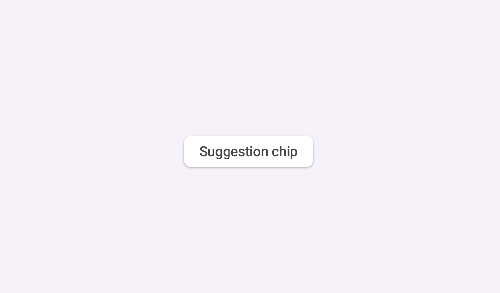
ElevatedSuggestionChip
Common
Chips help people enter information, make selections, filter content, or trigger actions. Chips can show multiple interactive elements together in the same area, such as a list of selectable movie times, or a series of email contacts.
Suggestion chips help narrow a user's intent by presenting dynamically generated suggestions, such as possible responses or search filters.
Last updated:
Installation
dependencies {
   implementation("androidx.compose.material3:material3:1.3.0-beta04")
}
Overloads
@Composable
fun ElevatedSuggestionChip(
    onClick: () -> Unit,
    label: @Composable () -> Unit,
    modifier: Modifier = Modifier,
    enabled: Boolean = true,
    icon: @Composable (() -> Unit)? = null,
    shape: Shape = SuggestionChipDefaults.shape,
    colors: ChipColors = SuggestionChipDefaults.elevatedSuggestionChipColors(),
    elevation: ChipElevation? = SuggestionChipDefaults.elevatedSuggestionChipElevation(),
    border: BorderStroke? = null,
    interactionSource: MutableInteractionSource? = null,
)
Parameters
| name | description |
|---|---|
onClick | called when this chip is clicked |
label | text label for this chip |
modifier | the [Modifier] to be applied to this chip |
enabled | controls the enabled state of this chip. When false, this component will not respond to user input, and it will appear visually disabled and disabled to accessibility services. |
icon | optional icon at the start of the chip, preceding the [label] text |
shape | defines the shape of this chip's container, border (when [border] is not null), and shadow (when using [elevation]) |
colors | [ChipColors] that will be used to resolve the colors used for this chip in |
elevation | [ChipElevation] used to resolve the elevation for this chip in different states. This controls the size of the shadow below the chip. Additionally, when the container color is [ColorScheme.surface], this controls the amount of primary color applied as an overlay. See [Surface] and [SuggestionChipDefaults.elevatedSuggestionChipElevation]. |
border | the border to draw around the container of this chip different states. See [SuggestionChipDefaults.elevatedSuggestionChipColors]. |
interactionSource | an optional hoisted [MutableInteractionSource] for observing and emitting [Interaction]s for this chip. You can use this to change the chip's appearance or preview the chip in different states. Note that if null is provided, interactions will still happen internally. |
@Composable
@Deprecated(
    "Maintained for binary compatibility. Use version with ElevatedSuggestionChip that take" +
        " a BorderStroke instead",
    replaceWith =
        ReplaceWith(
            "ElevatedSuggestionChip(onClick, label, modifier, enabled," +
                " icon, shape, colors, elevation, border, interactionSource"
        ),
    level = DeprecationLevel.HIDDEN

@Suppress("DEPRECATION"
fun ElevatedSuggestionChip(
    onClick: () -> Unit,
    label: @Composable () -> Unit,
    modifier: Modifier = Modifier,
    enabled: Boolean = true,
    icon: @Composable (() -> Unit)? = null,
    shape: Shape = SuggestionChipDefaults.shape,
    colors: ChipColors = SuggestionChipDefaults.elevatedSuggestionChipColors(),
    elevation: ChipElevation? = SuggestionChipDefaults.elevatedSuggestionChipElevation(),
    border: ChipBorder? = null,
    interactionSource: MutableInteractionSource = remember { MutableInteractionSource() },
)
Parameters
| name | description |
|---|---|
onClick | called when this chip is clicked |
label | text label for this chip |
modifier | the [Modifier] to be applied to this chip |
enabled | controls the enabled state of this chip. When false, this component will not respond to user input, and it will appear visually disabled and disabled to accessibility services. |
icon | optional icon at the start of the chip, preceding the [label] text |
shape | defines the shape of this chip's container, border (when [border] is not null), and shadow (when using [elevation]) |
colors | [ChipColors] that will be used to resolve the colors used for this chip in |
elevation | [ChipElevation] used to resolve the elevation for this chip in different states. This controls the size of the shadow below the chip. Additionally, when the container color is [ColorScheme.surface], this controls the amount of primary color applied as an overlay. See [Surface] and [SuggestionChipDefaults.elevatedSuggestionChipElevation]. |
border | the border to draw around the container of this chip different states. See [SuggestionChipDefaults.elevatedSuggestionChipColors]. |
interactionSource | the [MutableInteractionSource] representing the stream of [Interaction]s for this chip. You can create and pass in your own remembered instance to observe [Interaction]s and customize the appearance / behavior of this chip in different states. |
Code Example
ElevatedSuggestionChipSample
@Composable
@Sampled
@Preview
fun ElevatedSuggestionChipSample() {
    ElevatedSuggestionChip(onClick = { /* Do something! */ }, label = { Text("Suggestion Chip") })
}
