
← Compose Multiplatform Component in Material 3 Compose
FilterChip
Common
Chips help people enter information, make selections, filter content, or trigger actions. Chips can show multiple interactive elements together in the same area, such as a list of selectable movie times, or a series of email contacts.
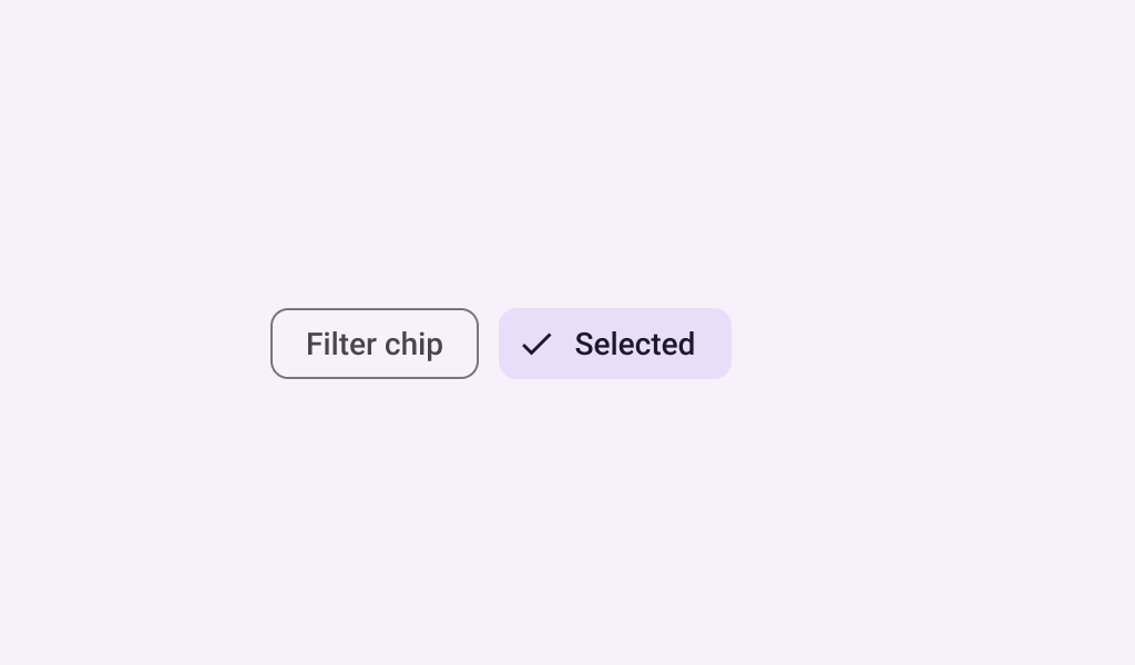
Filter chips use tags or descriptive words to filter content. They can be a good alternative to toggle buttons or checkboxes.
Last updated:
Installation
dependencies {
   implementation("androidx.compose.material3:material3:1.3.0-beta04")
}
Overloads
@Composable
fun FilterChip(
    selected: Boolean,
    onClick: () -> Unit,
    label: @Composable () -> Unit,
    modifier: Modifier = Modifier,
    enabled: Boolean = true,
    leadingIcon: @Composable (() -> Unit)? = null,
    trailingIcon: @Composable (() -> Unit)? = null,
    shape: Shape = FilterChipDefaults.shape,
    colors: SelectableChipColors = FilterChipDefaults.filterChipColors(),
    elevation: SelectableChipElevation? = FilterChipDefaults.filterChipElevation(),
    border: BorderStroke? = FilterChipDefaults.filterChipBorder(enabled, selected),
    interactionSource: MutableInteractionSource? = null
)
Parameters
| name | description |
|---|---|
selected | whether this chip is selected or not |
onClick | called when this chip is clicked |
label | text label for this chip |
modifier | the [Modifier] to be applied to this chip |
enabled | controls the enabled state of this chip. When false, this component will not respond to user input, and it will appear visually disabled and disabled to accessibility services. |
leadingIcon | optional icon at the start of the chip, preceding the [label] text. When [selected] is true, this icon may visually indicate that the chip is selected (for example, via a checkmark icon). |
trailingIcon | optional icon at the end of the chip |
shape | defines the shape of this chip's container, border (when [border] is not null), and shadow (when using [elevation]) |
colors | [SelectableChipColors] that will be used to resolve the colors used for this chip in different states. See [FilterChipDefaults.filterChipColors]. |
elevation | [SelectableChipElevation] used to resolve the elevation for this chip in different states. This controls the size of the shadow below the chip. Additionally, when the container color is [ColorScheme.surface], this controls the amount of primary color applied as an overlay. See [FilterChipDefaults.filterChipElevation]. |
border | the border to draw around the container of this chip. Pass null for no border. See [FilterChipDefaults.filterChipBorder]. |
interactionSource | an optional hoisted [MutableInteractionSource] for observing and emitting [Interaction]s for this chip. You can use this to change the chip's appearance or preview the chip in different states. Note that if null is provided, interactions will still happen internally. |
Code Examples
FilterChipSample
@Composable
@Sampled
@Preview
fun FilterChipSample() {
    var selected by remember { mutableStateOf(false) }
    FilterChip(
        selected = selected,
        onClick = { selected = !selected },
        label = { Text("Filter chip") },
        leadingIcon =
            if (selected) {
                {
                    Icon(
                        imageVector = Icons.Filled.Done,
                        contentDescription = "Localized Description",
                        modifier = Modifier.size(FilterChipDefaults.IconSize)
                    )
                }
            } else {
                null
            }
    )
}
FilterChipWithLeadingIconSample
@Composable
@Sampled
@Preview
fun FilterChipWithLeadingIconSample() {
    var selected by remember { mutableStateOf(false) }
    FilterChip(
        selected = selected,
        onClick = { selected = !selected },
        label = { Text("Filter chip") },
        leadingIcon =
            if (selected) {
                {
                    Icon(
                        imageVector = Icons.Filled.Done,
                        contentDescription = "Localized Description",
                        modifier = Modifier.size(FilterChipDefaults.IconSize)
                    )
                }
            } else {
                {
                    Icon(
                        imageVector = Icons.Filled.Home,
                        contentDescription = "Localized description",
                        modifier = Modifier.size(FilterChipDefaults.IconSize)
                    )
                }
            }
    )
}
