
← Compose Multiplatform Component in Material 3 Compose
ListItem
Common
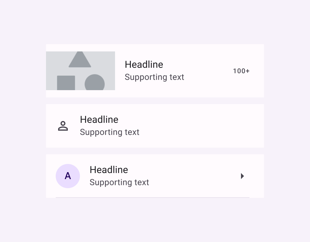
Lists are continuous, vertical indexes of text or images.
Last updated:
Installation
dependencies {
   implementation("androidx.compose.material3:material3:1.3.0-beta04")
}
Overloads
@Composable
fun ListItem(
    headlineContent: @Composable () -> Unit,
    modifier: Modifier = Modifier,
    overlineContent: @Composable (() -> Unit)? = null,
    supportingContent: @Composable (() -> Unit)? = null,
    leadingContent: @Composable (() -> Unit)? = null,
    trailingContent: @Composable (() -> Unit)? = null,
    colors: ListItemColors = ListItemDefaults.colors(),
    tonalElevation: Dp = ListItemDefaults.Elevation,
    shadowElevation: Dp = ListItemDefaults.Elevation,
)
Parameters
| name | description |
|---|---|
headlineContent | the headline content of the list item |
modifier | [Modifier] to be applied to the list item |
overlineContent | the content displayed above the headline content |
supportingContent | the supporting content of the list item |
leadingContent | the leading content of the list item |
trailingContent | the trailing meta text, icon, switch or checkbox |
colors | [ListItemColors] that will be used to resolve the background and content color for this list item in different states. See [ListItemDefaults.colors] |
tonalElevation | the tonal elevation of this list item |
shadowElevation | the shadow elevation of this list item |
Code Examples
OneLineListItem
@Composable
@Sampled
@Preview
fun OneLineListItem() {
    Column {
        ListItem(
            headlineContent = { Text("One line list item with 24x24 icon") },
            leadingContent = {
                Icon(
                    Icons.Filled.Favorite,
                    contentDescription = "Localized description",
                )
            }
        )
        HorizontalDivider()
    }
}
TwoLineListItem
@Composable
@Sampled
@Preview
fun TwoLineListItem() {
    Column {
        ListItem(
            headlineContent = { Text("Two line list item with trailing") },
            supportingContent = { Text("Secondary text") },
            trailingContent = { Text("meta") },
            leadingContent = {
                Icon(
                    Icons.Filled.Favorite,
                    contentDescription = "Localized description",
                )
            }
        )
        HorizontalDivider()
    }
}
ThreeLineListItemWithOverlineAndSupporting
@Composable
@Sampled
@Preview
fun ThreeLineListItemWithOverlineAndSupporting() {
    Column {
        ListItem(
            headlineContent = { Text("Three line list item") },
            overlineContent = { Text("OVERLINE") },
            supportingContent = { Text("Secondary text") },
            leadingContent = {
                Icon(
                    Icons.Filled.Favorite,
                    contentDescription = "Localized description",
                )
            },
            trailingContent = { Text("meta") }
        )
        HorizontalDivider()
    }
}
ThreeLineListItemWithExtendedSupporting
@Composable
@Sampled
@Preview
fun ThreeLineListItemWithExtendedSupporting() {
    Column {
        ListItem(
            headlineContent = { Text("Three line list item") },
            supportingContent = {
                Text("Secondary text that is long and perhaps goes onto another line")
            },
            leadingContent = {
                Icon(
                    Icons.Filled.Favorite,
                    contentDescription = "Localized description",
                )
            },
            trailingContent = { Text("meta") }
        )
        HorizontalDivider()
    }
}
