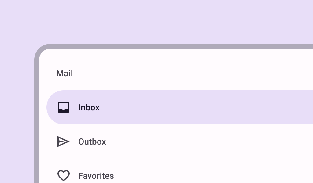
ModalNavigationDrawer
Source set: Common
@Composable
fun ModalNavigationDrawer(
    drawerContent: @Composable () -> Unit,
    modifier: Modifier = Modifier,
    drawerState: DrawerState = rememberDrawerState(DrawerValue.Closed),
    gesturesEnabled: Boolean = true,
    scrimColor: Color = DrawerDefaults.scrimColor,
    content: @Composable () -> Unit,
)
Parameters
| drawerContent | content inside this drawer |
| modifier | the Modifier to be applied to this drawer |
| drawerState | state of the drawer |
| gesturesEnabled | whether or not the drawer can be interacted by gestures |
| scrimColor | color of the scrim that obscures content when the drawer is open |
| content | content of the rest of the UI |
