← Back to Material 3 Compose
NavigationBarItem
Overview
Code Examples
Material Design navigation bar item.
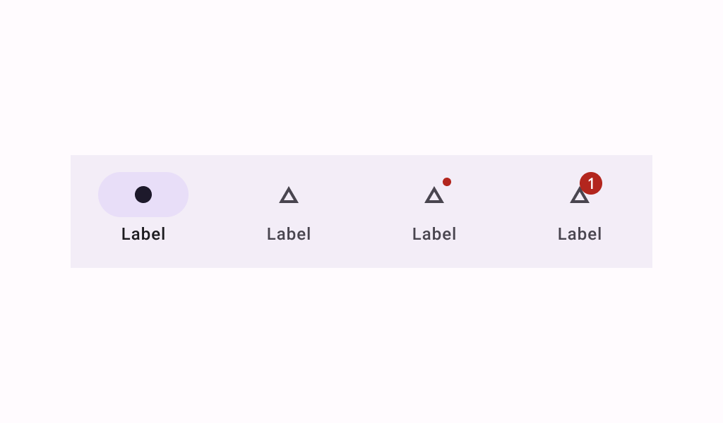
Navigation bars offer a persistent and convenient way to switch between primary destinations in an app.
The recommended configuration for a NavigationBarItem depends on how many items there are inside a NavigationBar:
- Three destinations: Display icons and text labels for all destinations.
- Four destinations: Active destinations display an icon and text label. Inactive destinations display icons, and text labels are recommended.
- Five destinations: Active destinations display an icon and text label. Inactive destinations use icons, and use text labels if space permits.
A NavigationBarItem always shows text labels (if it exists) when selected. Showing text labels if not selected is controlled by alwaysShowLabel.
@param selected whether this item is selected @param onClick called when this item is clicked @param icon icon for this item, typically an Icon @param modifier the Modifier to be applied to this item @param enabled controls the enabled state of this item. When false, this component will not respond to user input, and it will appear visually disabled and disabled to accessibility services. @param label optional text label for this item @param alwaysShowLabel whether to always show the label for this item. If false, the label will only be shown when this item is selected. @param colors NavigationBarItemColors that will be used to resolve the colors used for this item in different states. See NavigationBarItemDefaults.colors. @param interactionSource the MutableInteractionSource representing the stream of Interactions for this item. You can create and pass in your own remembered instance to observe Interactions and customize the appearance / behavior of this item in different states.
Overloads
NavigationBarItem
@Composable
fun RowScope.NavigationBarItem(
    selected: Boolean,
    onClick: () -> Unit,
    icon: @Composable () -> Unit,
    modifier: Modifier = Modifier,
    enabled: Boolean = true,
    label: @Composable (() -> Unit)? = null,
    alwaysShowLabel: Boolean = true,
    colors: NavigationBarItemColors = NavigationBarItemDefaults.colors(),
    interactionSource: MutableInteractionSource = remember { MutableInteractionSource() }
)
Parameters
| Name | Description |
|---|---|
selected | whether this item is selected |
onClick | called when this item is clicked |
icon | icon for this item, typically an Icon |
modifier | the Modifier to be applied to this item |
enabled | controls the enabled state of this item. When false, this component will not respond to user input, and it will appear visually disabled and disabled to accessibility services. |
label | optional text label for this item |
alwaysShowLabel | whether to always show the label for this item. If false, the label will only be shown when this item is selected. |
colors | NavigationBarItemColors that will be used to resolve the colors used for this item in different states. See NavigationBarItemDefaults.colors. |
interactionSource | the MutableInteractionSource representing the stream of Interactions for this item. You can create and pass in your own remembered instance to observe Interactions and customize the appearance / behavior of this item in different states |