
← Compose Multiplatform Component in Material 3 Compose
RadioButton
Common
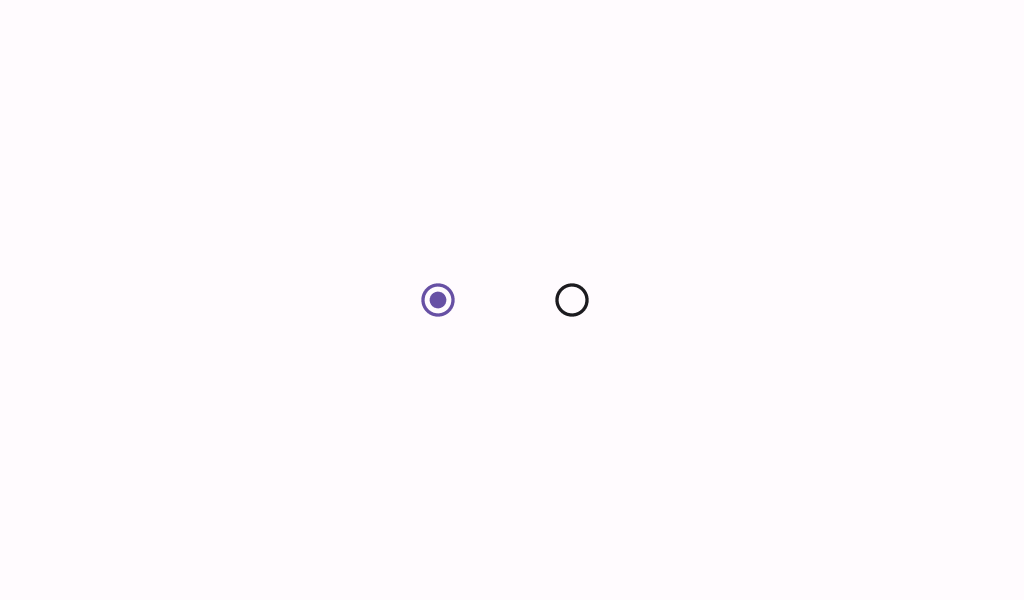
Radio buttons allow users to select one option from a set.
Last updated:
Installation
dependencies {
   implementation("androidx.compose.material3:material3:1.3.0-beta04")
}
Overloads
@Composable
fun RadioButton(
    selected: Boolean,
    onClick: (() -> Unit)?,
    modifier: Modifier = Modifier,
    enabled: Boolean = true,
    colors: RadioButtonColors = RadioButtonDefaults.colors(),
    interactionSource: MutableInteractionSource? = null
)
Parameters
| name | description |
|---|---|
selected | whether this radio button is selected or not |
onClick | called when this radio button is clicked. If null, then this radio button will not be interactable, unless something else handles its input events and updates its state. |
modifier | the [Modifier] to be applied to this radio button |
enabled | controls the enabled state of this radio button. When false, this component will not respond to user input, and it will appear visually disabled and disabled to accessibility services. |
colors | [RadioButtonColors] that will be used to resolve the color used for this radio button in different states. See [RadioButtonDefaults.colors]. |
interactionSource | an optional hoisted [MutableInteractionSource] for observing and emitting [Interaction]s for this radio button. You can use this to change the radio button's appearance or preview the radio button in different states. Note that if null is provided, interactions will still happen internally. |
Code Examples
RadioButtonSample
@Composable
@Sampled
@Preview
fun RadioButtonSample() {
    // We have two radio buttons and only one can be selected
    var state by remember { mutableStateOf(true) }
    // Note that Modifier.selectableGroup() is essential to ensure correct accessibility behavior.
    // We also set a content description for this sample, but note that a RadioButton would usually
    // be part of a higher level component, such as a raw with text, and that component would need
    // to provide an appropriate content description. See RadioGroupSample.
    Row(Modifier.selectableGroup()) {
        RadioButton(
            selected = state,
            onClick = { state = true },
            modifier = Modifier.semantics { contentDescription = "Localized Description" }
        )
        RadioButton(
            selected = !state,
            onClick = { state = false },
            modifier = Modifier.semantics { contentDescription = "Localized Description" }
        )
    }
}
RadioGroupSample
@Composable
@Sampled
@Preview
fun RadioGroupSample() {
    val radioOptions = listOf("Calls", "Missed", "Friends")
    val (selectedOption, onOptionSelected) = remember { mutableStateOf(radioOptions[0]) }
    // Note that Modifier.selectableGroup() is essential to ensure correct accessibility behavior
    Column(Modifier.selectableGroup()) {
        radioOptions.forEach { text ->
            Row(
                Modifier.fillMaxWidth()
                    .height(56.dp)
                    .selectable(
                        selected = (text == selectedOption),
                        onClick = { onOptionSelected(text) },
                        role = Role.RadioButton
                    )
                    .padding(horizontal = 16.dp),
                verticalAlignment = Alignment.CenterVertically
            ) {
                RadioButton(
                    selected = (text == selectedOption),
                    onClick = null // null recommended for accessibility with screenreaders
                )
                Text(
                    text = text,
                    style = MaterialTheme.typography.bodyLarge,
                    modifier = Modifier.padding(start = 16.dp)
                )
            }
        }
    }
}
