
← Compose Multiplatform Component in Material 3 Compose
TextField
Common
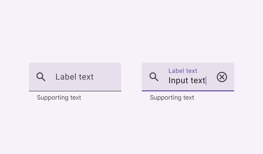
Text fields allow users to enter text into a UI. They typically appear in forms and dialogs. Filled text fields have more visual emphasis than outlined text fields, making them stand out when surrounded by other content and components.
Last updated:
Installation
dependencies {
   implementation("androidx.compose.material3:material3:1.3.0-beta04")
}
Overloads
@Composable
@OptIn(ExperimentalMaterial3Api::class
fun TextField(
    value: String,
    onValueChange: (String) -> Unit,
    modifier: Modifier = Modifier,
    enabled: Boolean = true,
    readOnly: Boolean = false,
    textStyle: TextStyle = LocalTextStyle.current,
    label: @Composable (() -> Unit)? = null,
    placeholder: @Composable (() -> Unit)? = null,
    leadingIcon: @Composable (() -> Unit)? = null,
    trailingIcon: @Composable (() -> Unit)? = null,
    prefix: @Composable (() -> Unit)? = null,
    suffix: @Composable (() -> Unit)? = null,
    supportingText: @Composable (() -> Unit)? = null,
    isError: Boolean = false,
    visualTransformation: VisualTransformation = VisualTransformation.None,
    keyboardOptions: KeyboardOptions = KeyboardOptions.Default,
    keyboardActions: KeyboardActions = KeyboardActions.Default,
    singleLine: Boolean = false,
    maxLines: Int = if (singleLine) 1 else Int.MAX_VALUE,
    minLines: Int = 1,
    interactionSource: MutableInteractionSource? = null,
    shape: Shape = TextFieldDefaults.shape,
    colors: TextFieldColors = TextFieldDefaults.colors()
)
Parameters
| name | description |
|---|---|
value | the input text to be shown in the text field |
onValueChange | the callback that is triggered when the input service updates the text. An updated text comes as a parameter of the callback |
modifier | the [Modifier] to be applied to this text field |
enabled | controls the enabled state of this text field. When false, this component will not respond to user input, and it will appear visually disabled and disabled to accessibility services. |
readOnly | controls the editable state of the text field. When true, the text field cannot be modified. However, a user can focus it and copy text from it. Read-only text fields are usually used to display pre-filled forms that a user cannot edit. |
textStyle | the style to be applied to the input text. Defaults to [LocalTextStyle]. |
label | the optional label to be displayed inside the text field container. The default text style for internal [Text] is [Typography.bodySmall] when the text field is in focus and [Typography.bodyLarge] when the text field is not in focus |
placeholder | the optional placeholder to be displayed when the text field is in focus and the input text is empty. The default text style for internal [Text] is [Typography.bodyLarge] |
leadingIcon | the optional leading icon to be displayed at the beginning of the text field container |
trailingIcon | the optional trailing icon to be displayed at the end of the text field container |
prefix | the optional prefix to be displayed before the input text in the text field |
suffix | the optional suffix to be displayed after the input text in the text field |
supportingText | the optional supporting text to be displayed below the text field |
isError | indicates if the text field's current value is in error. If set to true, the label, bottom indicator and trailing icon by default will be displayed in error color |
visualTransformation | transforms the visual representation of the input [value] For example, you can use [PasswordVisualTransformation][androidx.compose.ui.text.input.PasswordVisualTransformation] to create a password text field. By default, no visual transformation is applied. |
keyboardOptions | software keyboard options that contains configuration such as [KeyboardType] and [ImeAction]. |
keyboardActions | when the input service emits an IME action, the corresponding callback is called. Note that this IME action may be different from what you specified in [KeyboardOptions.imeAction]. |
singleLine | when true, this text field becomes a single horizontally scrolling text field instead of wrapping onto multiple lines. The keyboard will be informed to not show the return key as the [ImeAction]. Note that [maxLines] parameter will be ignored as the maxLines attribute will be automatically set to 1. |
maxLines | the maximum height in terms of maximum number of visible lines. It is required that 1 <= [minLines] <= [maxLines]. This parameter is ignored when [singleLine] is true. |
minLines | the minimum height in terms of minimum number of visible lines. It is required that 1 <= [minLines] <= [maxLines]. This parameter is ignored when [singleLine] is true. |
interactionSource | an optional hoisted [MutableInteractionSource] for observing and emitting [Interaction]s for this text field. You can use this to change the text field's appearance or preview the text field in different states. Note that if null is provided, interactions will still happen internally. |
shape | defines the shape of this text field's container |
colors | [TextFieldColors] that will be used to resolve the colors used for this text field in different states. See [TextFieldDefaults.colors]. |
@Composable
@OptIn(ExperimentalMaterial3Api::class
fun TextField(
    value: TextFieldValue,
    onValueChange: (TextFieldValue) -> Unit,
    modifier: Modifier = Modifier,
    enabled: Boolean = true,
    readOnly: Boolean = false,
    textStyle: TextStyle = LocalTextStyle.current,
    label: @Composable (() -> Unit)? = null,
    placeholder: @Composable (() -> Unit)? = null,
    leadingIcon: @Composable (() -> Unit)? = null,
    trailingIcon: @Composable (() -> Unit)? = null,
    prefix: @Composable (() -> Unit)? = null,
    suffix: @Composable (() -> Unit)? = null,
    supportingText: @Composable (() -> Unit)? = null,
    isError: Boolean = false,
    visualTransformation: VisualTransformation = VisualTransformation.None,
    keyboardOptions: KeyboardOptions = KeyboardOptions.Default,
    keyboardActions: KeyboardActions = KeyboardActions.Default,
    singleLine: Boolean = false,
    maxLines: Int = if (singleLine) 1 else Int.MAX_VALUE,
    minLines: Int = 1,
    interactionSource: MutableInteractionSource? = null,
    shape: Shape = TextFieldDefaults.shape,
    colors: TextFieldColors = TextFieldDefaults.colors()
)
Parameters
| name | description |
|---|---|
value | the input [TextFieldValue] to be shown in the text field |
onValueChange | the callback that is triggered when the input service updates values in [TextFieldValue]. An updated [TextFieldValue] comes as a parameter of the callback |
modifier | the [Modifier] to be applied to this text field |
enabled | controls the enabled state of this text field. When false, this component will not respond to user input, and it will appear visually disabled and disabled to accessibility services. |
readOnly | controls the editable state of the text field. When true, the text field cannot be modified. However, a user can focus it and copy text from it. Read-only text fields are usually used to display pre-filled forms that a user cannot edit. |
textStyle | the style to be applied to the input text. Defaults to [LocalTextStyle]. |
label | the optional label to be displayed inside the text field container. The default text style for internal [Text] is [Typography.bodySmall] when the text field is in focus and [Typography.bodyLarge] when the text field is not in focus |
placeholder | the optional placeholder to be displayed when the text field is in focus and the input text is empty. The default text style for internal [Text] is [Typography.bodyLarge] |
leadingIcon | the optional leading icon to be displayed at the beginning of the text field container |
trailingIcon | the optional trailing icon to be displayed at the end of the text field container |
prefix | the optional prefix to be displayed before the input text in the text field |
suffix | the optional suffix to be displayed after the input text in the text field |
supportingText | the optional supporting text to be displayed below the text field |
isError | indicates if the text field's current value is in error state. If set to true, the label, bottom indicator and trailing icon by default will be displayed in error color |
visualTransformation | transforms the visual representation of the input [value]. For example, you can use [PasswordVisualTransformation][androidx.compose.ui.text.input.PasswordVisualTransformation] to create a password text field. By default, no visual transformation is applied. |
keyboardOptions | software keyboard options that contains configuration such as [KeyboardType] and [ImeAction]. |
keyboardActions | when the input service emits an IME action, the corresponding callback is called. Note that this IME action may be different from what you specified in [KeyboardOptions.imeAction]. |
singleLine | when true, this text field becomes a single horizontally scrolling text field instead of wrapping onto multiple lines. The keyboard will be informed to not show the return key as the [ImeAction]. Note that [maxLines] parameter will be ignored as the maxLines attribute will be automatically set to 1. |
maxLines | the maximum height in terms of maximum number of visible lines. It is required that 1 <= [minLines] <= [maxLines]. This parameter is ignored when [singleLine] is true. |
minLines | the minimum height in terms of minimum number of visible lines. It is required that 1 <= [minLines] <= [maxLines]. This parameter is ignored when [singleLine] is true. |
interactionSource | an optional hoisted [MutableInteractionSource] for observing and emitting [Interaction]s for this text field. You can use this to change the text field's appearance or preview the text field in different states. Note that if null is provided, interactions will still happen internally. |
shape | defines the shape of this text field's container |
colors | [TextFieldColors] that will be used to resolve the colors used for this text field in different states. See [TextFieldDefaults.colors]. |
Code Examples
SimpleTextFieldSample
@Composable
@Sampled
@Preview
fun SimpleTextFieldSample() {
    var text by rememberSaveable { mutableStateOf("") }

    TextField(
        value = text,
        onValueChange = { text = it },
        label = { Text("Label") },
        singleLine = true
    )
}
TextFieldWithPlaceholder
@Composable
@Sampled
@Preview
fun TextFieldWithPlaceholder() {
    var text by rememberSaveable { mutableStateOf("") }

    TextField(
        value = text,
        onValueChange = { text = it },
        label = { Text("Email") },
        placeholder = { Text("example@gmail.com") }
    )
}
TextFieldWithIcons
@Composable
@Sampled
@Preview
fun TextFieldWithIcons() {
    var text by rememberSaveable { mutableStateOf("") }

    TextField(
        value = text,
        onValueChange = { text = it },
        label = { Text("Label") },
        leadingIcon = { Icon(Icons.Filled.Favorite, contentDescription = "Localized description") },
        trailingIcon = { Icon(Icons.Filled.Info, contentDescription = "Localized description") }
    )
}
TextFieldWithPrefixAndSuffix
@Composable
@Sampled
@Preview
fun TextFieldWithPrefixAndSuffix() {
    var text by rememberSaveable { mutableStateOf("") }

    TextField(
        value = text,
        onValueChange = { text = it },
        singleLine = true,
        label = { Text("Label") },
        prefix = { Text("www.") },
        suffix = { Text(".com") },
        placeholder = { Text("google") },
    )
}
TextFieldWithErrorState
@Composable
@Sampled
@Preview
fun TextFieldWithErrorState() {
    val errorMessage = "Text input too long"
    var text by rememberSaveable { mutableStateOf("") }
    var isError by rememberSaveable { mutableStateOf(false) }
    val charLimit = 10

    fun validate(text: String) {
        isError = text.length > charLimit
    }

    TextField(
        value = text,
        onValueChange = {
            text = it
            validate(text)
        },
        singleLine = true,
        label = { Text(if (isError) "Username*" else "Username") },
        supportingText = {
            Row {
                Text(if (isError) errorMessage else "", Modifier.clearAndSetSemantics {})
                Spacer(Modifier.weight(1f))
                Text("Limit: ${text.length}/$charLimit")
            }
        },
        isError = isError,
        keyboardActions = KeyboardActions { validate(text) },
        modifier =
            Modifier.semantics {
                // Provide localized description of the error
                if (isError) error(errorMessage)
            }
    )
}
TextFieldWithSupportingText
@Composable
@Sampled
@Preview
fun TextFieldWithSupportingText() {
    var text by rememberSaveable { mutableStateOf("") }

    TextField(
        value = text,
        onValueChange = { text = it },
        label = { Text("Label") },
        supportingText = {
            Text("Supporting text that is long and perhaps goes onto another line.")
        },
    )
}
PasswordTextField
@Composable
@Sampled
@Preview
fun PasswordTextField() {
    var password by rememberSaveable { mutableStateOf("") }
    var passwordHidden by rememberSaveable { mutableStateOf(true) }
    TextField(
        value = password,
        onValueChange = { password = it },
        singleLine = true,
        label = { Text("Enter password") },
        visualTransformation =
            if (passwordHidden) PasswordVisualTransformation() else VisualTransformation.None,
        keyboardOptions = KeyboardOptions(keyboardType = KeyboardType.Password),
        trailingIcon = {
            IconButton(onClick = { passwordHidden = !passwordHidden }) {
                val visibilityIcon =
                    if (passwordHidden) Icons.Filled.Visibility else Icons.Filled.VisibilityOff
                // Please provide localized description for accessibility services
                val description = if (passwordHidden) "Show password" else "Hide password"
                Icon(imageVector = visibilityIcon, contentDescription = description)
            }
        }
    )
}
TextFieldWithHideKeyboardOnImeAction
@Composable
@Sampled
@Preview
@OptIn(ExperimentalComposeUiApi::class
fun TextFieldWithHideKeyboardOnImeAction() {
    val keyboardController = LocalSoftwareKeyboardController.current
    var text by rememberSaveable { mutableStateOf("") }
    TextField(
        value = text,
        onValueChange = { text = it },
        label = { Text("Label") },
        keyboardOptions = KeyboardOptions(imeAction = ImeAction.Done),
        keyboardActions =
            KeyboardActions(
                onDone = {
                    keyboardController?.hide()
                    // do something here
                }
            )
    )
}
TextFieldSample
@Composable
@Sampled
@Preview
fun TextFieldSample() {
    var text by
        rememberSaveable(stateSaver = TextFieldValue.Saver) {
            mutableStateOf(TextFieldValue("example", TextRange(0, 7)))
        }

    TextField(value = text, onValueChange = { text = it }, label = { Text("Label") })
}
