
Today we are doing a deep dive into dialogs. We'll start with the technical bits, how to use them in Jetpack Compose and all the juicy bits. We'll then explore what different types of dialogs there are and how to use them.
Let's go.
Dialog vs AlertDialog
Dialogs are modal pieces of UI that display important information to the user and ask them to make a decision. They block the rest of the app when they are visible and they might take a part of the screen or be full-screen. The important bit to note is that they interrupt the user from whatever they were doing in the app.
Jetpack Compose comes with a variety of dialogs. The most basic kind of Dialog() will prevent the user from interacting with the rest of the app when shown. However, you will need to draw your own UI of how the dialog will look to the end user.
AlertDialogs on the other hand have a standard look. This usually consists of a title, body and buttons.
What kind of dialogs are available in Jetpack Compose?
There are currently a few variations of dialogs available: the default Dialog() which is part of the Compose-UI library. There are also the Material 3 and Material 2 versions of AlertDialog. The Material 3 library also has the DatePickerDialog() dialog that allows the user to select a date in a year. Lastly, the Wear library comes with its own Dialog() implementation suitable for wearables.
You can find all available dialogs in the Jetpack Compose Components list.
How to show and hide a dialog
Dialogs in Jetpack Compose are part of the given layout. In order to display or hide the dialog, you would need to add or remove it from the composition.
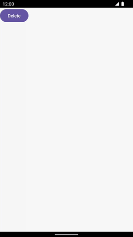
In this example, we keep the state of the dialog's visibility as a boolean:
var showDialog by remember { mutableStateOf(false) }

Button(onClick = { showDialog = showDialog.not() }) {
    Text("Delete")
}

if (showDialog) {
    AlertDialog(
        onDismissRequest = { showDialog = false },
        title = { Text("Are you sure you want to delete this?") },
        text = { Text("This action cannot be undone") },
        confirmButton = {
            TextButton(onClick = { /* TODO */}) {
                Text("Delete it".uppercase())
            }
        },
        dismissButton = {
            TextButton(onClick = { showDialog = false }) {
                Text("Cancel".uppercase())
            }
        },
    )
}
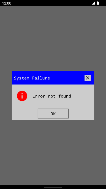
How to create a custom looking dialog
Use the Dialog() composable to display the dialog on the screen.
The sky is the limit towards what kind of dialog you can create. Here is an example of a dialog with the classic Windows 95 style:
@OptIn(ExperimentalMaterial3Api::class)
@Composable
fun RetroDialog(
    title: String,
    message: String,
    backgroundColor: Color = Color(0xFFCCCCCC),
    onDismissRequest: () -> Unit
) {
    Dialog(onDismissRequest = onDismissRequest) {
        Box(
            Modifier
                .clip(RectangleShape)
                .fillMaxWidth()
                .background(backgroundColor)
        ) {
            Column {
                Row(
                    Modifier
                        .fillMaxWidth()
                        .background(Color.Blue)
                        .padding(start = 8.dp),
                    horizontalArrangement = Arrangement.SpaceBetween,
                    verticalAlignment = Alignment.CenterVertically
                ) {
                    Text(title, color = Color.White, fontFamily = FontFamily.Monospace)
                    Surface(
                        onClick = onDismissRequest, shape = RectangleShape,
                        modifier = Modifier.padding(2.dp),
                        color = backgroundColor
                    ) {
                        Icon(Icons.Default.Close, contentDescription = "Close")
                    }
                }

                Row(
                    modifier = Modifier.padding(
                        horizontal = 16.dp,
                        vertical = 20.dp
                    ),
                    verticalAlignment = Alignment.CenterVertically,
                    horizontalArrangement = Arrangement.spacedBy(16.dp)
                ) {
                    Icon(
                        Icons.Filled.Info,
                        contentDescription = "Error",
                        tint = Color.Red,
                        modifier = Modifier.size(48.dp)
                    )

                    Text(message, fontFamily = FontFamily.Monospace)
                }
                Surface(
                    modifier = Modifier.align(Alignment.CenterHorizontally),
                    onClick = onDismissRequest,
                    shape = RectangleShape,
                    color = backgroundColor,
                    border = BorderStroke(Dp.Hairline, Color.Black),
                ) {
                    Text(
                        "OK", fontFamily = FontFamily.Monospace,
                        modifier = Modifier
                            .widthIn(120.dp)
                            .padding(vertical = 8.dp),
                        textAlign = TextAlign.Center
                    )
                }
            }
        }
    }
}
How to customize the looks of your AlertDialogs
Creating your own custom Dialog() from scratch is probably an overkill most of the time. Keep in mind that people will hardly ever install your app because of that unique looking dialog style of yours.
Instead of reinventing the wheel, you can adjust the existing AlertDialogs that people are accustomed to. If you want to differentiate its looks to other apps, keep reading:
How to create a rounded corner shaped AlertDialog()
Pass a RoundedCornerShape() into the shape parameter of your AlertDialog.
Alternatively, use your MaterialTheme in order to modify the looks of all dialogs in your app (full tutorial here).
AlertDialog(
    shape = RoundedCornerShape(20.dp),
    onDismissRequest = { showDialog = false },
    text = {
        Text("I have rounded corners")
    },
    confirmButton = {
        TextButton(onClick = { showDialog = false }) {
            Text("Dismiss")
        }
    },
)
How to change the color of your AlertDialog
There is currently no way to pass a specific color to the AlertDialog() composable in order to change it's background color.
However, the background color of the AlertDialog() is taken from the MaterialTheme's surface color. Modify that to update the background color of your AlertDialogs instead.
How to prevent dialogs from dismissing when click outside
The properties parameter of the dialog accepts a DialogProperties. In order to prevent the dialog from being dismissed when tapped outside, pass false to dismissOnClickOutside. Similarly, return false to dismissOnBackPress to prevent dismissals on back press.
That's all about dialogs for today. Tune in next week for more Jetpack Compose goodies.
Related Resources
- Compose Unstyled Dialog at composeunstyled.com
