← Compose Multiplatform Component in Tv Material Compose
ClassicCard
Android
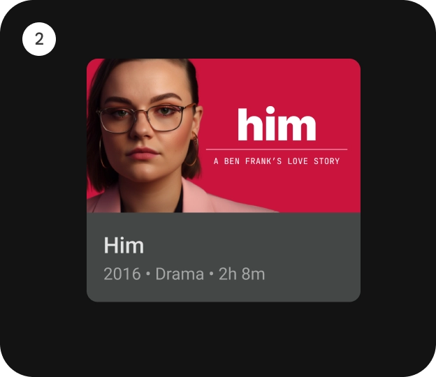
[ClassicCard] is an opinionated TV Material card that offers a 4 slot layout to show information about a subject.
This card has a vertical layout with the interactive surface [Surface], which provides the image slot at the top, followed by the title, subtitle, and description slots.

Checkout TV design guidelines to learn more about Material Classic Card.
This Card handles click events, calling its [onClick] lambda.
Last updated:
Installation
dependencies {
   implementation("androidx.tv:tv-material:1.0.0-beta01")
}
Overloads
@Composable
fun ClassicCard(
    onClick: () -> Unit,
    image: @Composable BoxScope.() -> Unit,
    title: @Composable () -> Unit,
    modifier: Modifier = Modifier,
    onLongClick: (() -> Unit)? = null,
    subtitle: @Composable () -> Unit = {},
    description: @Composable () -> Unit = {},
    shape: CardShape = CardDefaults.shape(),
    colors: CardColors = CardDefaults.colors(),
    scale: CardScale = CardDefaults.scale(),
    border: CardBorder = CardDefaults.border(),
    glow: CardGlow = CardDefaults.glow(),
    contentPadding: PaddingValues = PaddingValues(),
    interactionSource: MutableInteractionSource? = null
)
Parameters
| name | description |
|---|---|
onClick | called when this card is clicked. |
image | defines the [Composable] image to be displayed on top of the Card. |
title | defines the [Composable] title placed below the image in the Card. |
modifier | the [Modifier] to be applied to this card. |
onLongClick | called when this card is long clicked (long-pressed). |
subtitle | defines the [Composable] supporting text placed below the title of the Card. |
description | defines the [Composable] description placed below the subtitle of the Card. |
shape | [CardShape] defines the shape of this card's container in different interaction states. See [CardDefaults.shape]. |
colors | [CardColors] defines the background & content colors used in this card for different interaction states. See [CardDefaults.colors]. |
scale | [CardScale] defines size of the card relative to its original size for different interaction states. See [CardDefaults.scale]. |
border | [CardBorder] defines a border around the card for different interaction states. See [CardDefaults.border]. |
glow | [CardGlow] defines a shadow to be shown behind the card for different interaction states. See [CardDefaults.glow]. |
contentPadding | [PaddingValues] defines the inner padding applied to the card's content. |
interactionSource | an optional hoisted [MutableInteractionSource] for observing and emitting [Interaction]s for this card. You can use this to change the card's appearance or preview the card in different states. Note that if null is provided, interactions will still happen internally. |
Code Example
ClassicCardSample
@Composable
@Sampled
fun ClassicCardSample() {
    ClassicCard(
        modifier = Modifier.size(150.dp, 120.dp),
        image = {
            Box(
                modifier = Modifier
                    .fillMaxWidth()
                    .height(80.dp)
                    .background(Color.Blue)
            )
        },
        title = {
            Text("Classic Card")
        },
        contentPadding = PaddingValues(8.dp),
        onClick = { }
    )
}
