
← Compose Multiplatform Component in Tv Material Compose
StandardCardContainer
Android
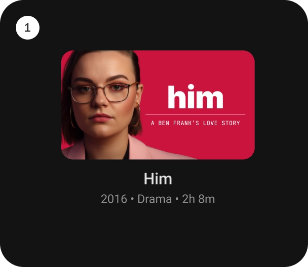
[StandardCardContainer] is an opinionated TV Material Card layout with an image and text content to show information about a subject.
It provides a vertical layout with an image card slot at the top. And below that, there are slots for the title, subtitle and description.
Last updated:
Installation
dependencies {
   implementation("androidx.tv:tv-material:1.0.0-beta01")
}
Overloads
@Composable
fun StandardCardContainer(
    imageCard: @Composable (interactionSource: MutableInteractionSource) -> Unit,
    title: @Composable () -> Unit,
    modifier: Modifier = Modifier,
    subtitle: @Composable () -> Unit = {},
    description: @Composable () -> Unit = {},
    contentColor: CardContainerColors = CardContainerDefaults.contentColor(),
    interactionSource: MutableInteractionSource = remember { MutableInteractionSource() }
)
Parameters
| name | description |
|---|---|
imageCard | defines the [Composable] to be used for the image card. |
title | defines the [Composable] title placed below the image card in the CardContainer. |
modifier | the [Modifier] to be applied to this CardContainer. |
subtitle | defines the [Composable] supporting text placed below the title in CardContainer. |
description | defines the [Composable] description placed below the subtitle in CardContainer. |
contentColor | [CardContainerColors] defines the content color used in the CardContainer for different interaction states. See [CardContainerDefaults.contentColor]. |
interactionSource | a hoisted [MutableInteractionSource] for observing and emitting [Interaction]s for this CardContainer. This interaction source param would also be forwarded to be used with the imageCard composable. |
Code Example
StandardCardContainerSample
@Composable
@Sampled
fun StandardCardContainerSample() {
    StandardCardContainer(
        modifier = Modifier.size(150.dp, 120.dp),
        imageCard = { interactionSource ->
            Card(
                onClick = { },
                interactionSource = interactionSource
            ) {
                Box(
                    modifier = Modifier
                        .fillMaxWidth()
                        .height(80.dp)
                        .background(Color.Blue)
                )
            }
        },
        title = { Text("Standard Card") }
    )
}
