
← Compose Multiplatform Component in Tv Material Compose
WideClassicCard
Android
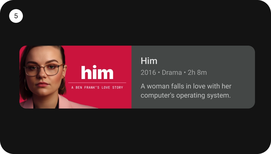
[WideClassicCard] is an opinionated TV Material card that offers a 4 slot layout to show information about a subject.
This card has a horizontal layout with the interactive surface [Surface], which provides the image slot at the start, followed by the title, subtitle, and description slots at the end.
This Card handles click events, calling its [onClick] lambda.
Last updated:
Installation
dependencies {
   implementation("androidx.tv:tv-material:1.0.0-beta01")
}
Overloads
@Composable
fun WideClassicCard(
    onClick: () -> Unit,
    image: @Composable BoxScope.() -> Unit,
    title: @Composable () -> Unit,
    modifier: Modifier = Modifier,
    onLongClick: (() -> Unit)? = null,
    subtitle: @Composable () -> Unit = {},
    description: @Composable () -> Unit = {},
    shape: CardShape = CardDefaults.shape(),
    colors: CardColors = CardDefaults.colors(),
    scale: CardScale = CardDefaults.scale(),
    border: CardBorder = CardDefaults.border(),
    glow: CardGlow = CardDefaults.glow(),
    contentPadding: PaddingValues = PaddingValues(),
    interactionSource: MutableInteractionSource? = null
)
Parameters
| name | description |
|---|---|
onClick | called when this card is clicked. |
image | defines the [Composable] image to be displayed on top of the Card. |
title | defines the [Composable] title placed below the image in the Card. |
modifier | the [Modifier] to be applied to this card. |
onLongClick | called when this card is long clicked (long-pressed). |
subtitle | defines the [Composable] supporting text placed below the title of the Card. |
description | defines the [Composable] description placed below the subtitle of the Card. |
shape | [CardShape] defines the shape of this card's container in different interaction states. See [CardDefaults.shape]. |
colors | [CardColors] defines the background & content colors used in this card for different interaction states. See [CardDefaults.colors]. |
scale | [CardScale] defines size of the card relative to its original size for different interaction states. See [CardDefaults.scale]. |
border | [CardBorder] defines a border around the card for different interaction states. See [CardDefaults.border]. |
glow | [CardGlow] defines a shadow to be shown behind the card for different interaction states. See [CardDefaults.glow]. |
contentPadding | [PaddingValues] defines the inner padding applied to the card's content. |
interactionSource | an optional hoisted [MutableInteractionSource] for observing and emitting [Interaction]s for this card. You can use this to change the card's appearance or preview the card in different states. Note that if null is provided, interactions will still happen internally. |
Code Example
WideClassicCardSample
@Composable
@Sampled
fun WideClassicCardSample() {
    WideClassicCard(
        modifier = Modifier.size(180.dp, 100.dp),
        image = {
            Box(
                modifier = Modifier
                    .fillMaxWidth()
                    .height(80.dp)
                    .background(Color.Blue)
            )
        },
        title = {
            Text(
                text = "Wide Classic Card",
                modifier = Modifier.padding(start = 8.dp)
            )
        },
        contentPadding = PaddingValues(8.dp),
        onClick = { }
    )
}
