← Back to Material 3 Compose
Button
Component
in
Material 3
. Since 1.0.0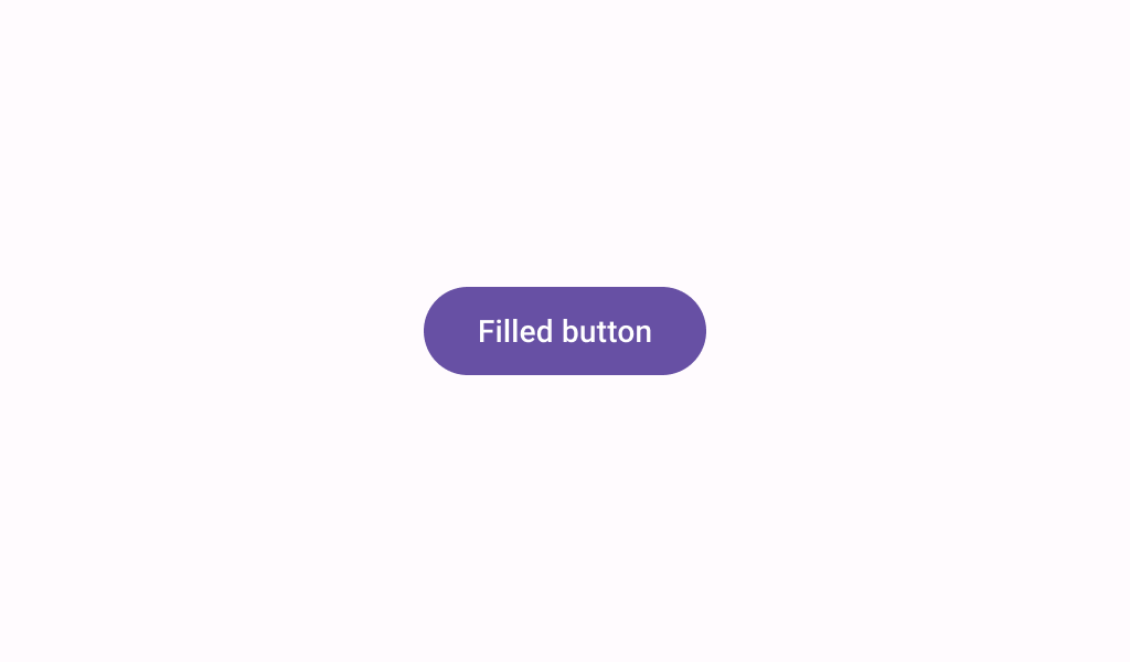
Overview
Code Examples
Video
<a href="https://m3.material.io/components/buttons/overview" class="external" target="_blank">Material Design button</a>.
Buttons help people initiate actions, from sending an email, to sharing a document, to liking a post.
!Filled button image(https://developer.android.com/images/reference/androidx/compose/material3/filled-button.png)
Filled buttons are high-emphasis buttons. Filled buttons have the most visual impact after the FloatingActionButton, and should be used for important, final actions that complete a flow, like "Save", "Join now", or "Confirm".
Overloads
Button
@Composable
fun Button(
    onClick: () -> Unit,
    modifier: Modifier = Modifier,
    enabled: Boolean = true,
    shape: Shape = ButtonDefaults.shape,
    colors: ButtonColors = ButtonDefaults.buttonColors(),
    elevation: ButtonElevation? = ButtonDefaults.buttonElevation(),
    border: BorderStroke? = null,
    contentPadding: PaddingValues = ButtonDefaults.ContentPadding,
    interactionSource: MutableInteractionSource = remember { MutableInteractionSource() },
    content: @Composable RowScope.() -> Unit
)
Parameters
| Name | Description |
|---|---|
onClick | called when this button is clicked |
modifier | the Modifier to be applied to this button |
enabled | controls the enabled state of this button. When false, this component will not respond to user input, and it will appear visually disabled and disabled to accessibility services. |
shape | defines the shape of this button's container, border (when border is not null), and shadow (when using elevation) |
colors | ButtonColors that will be used to resolve the colors for this button in different states. See ButtonDefaults.buttonColors. |
elevation | ButtonElevation used to resolve the elevation for this button in different states. This controls the size of the shadow below the button. Additionally, when the container color is ColorScheme.surface, this controls the amount of primary color applied as an overlay. See ButtonElevation.shadowElevation and ButtonElevation.tonalElevation. |
border | the border to draw around the container of this button |
contentPadding | the spacing values to apply internally between the container and the content |
interactionSource | the MutableInteractionSource representing the stream of Interactions for this button. You can create and pass in your own remembered instance to observe Interactions and customize the appearance / behavior of this button in different states |