
← Compose Multiplatform Component in Material 3 Compose
BottomAppBar
Common
A bottom app bar displays navigation and key actions at the bottom of mobile screens.
Last updated:
Installation
dependencies {
   implementation("androidx.compose.material3:material3:1.3.0-beta04")
}
Overloads
@Composable
@OptIn(ExperimentalMaterial3Api::class
fun BottomAppBar(
    actions: @Composable RowScope.() -> Unit,
    modifier: Modifier = Modifier,
    floatingActionButton: @Composable (() -> Unit)? = null,
    containerColor: Color = BottomAppBarDefaults.containerColor,
    contentColor: Color = contentColorFor(containerColor),
    tonalElevation: Dp = BottomAppBarDefaults.ContainerElevation,
    contentPadding: PaddingValues = BottomAppBarDefaults.ContentPadding,
    windowInsets: WindowInsets = BottomAppBarDefaults.windowInsets,
)
Parameters
| name | description |
|---|---|
actions | the icon content of this BottomAppBar. The default layout here is a [Row], so content inside will be placed horizontally. |
modifier | the [Modifier] to be applied to this BottomAppBar |
floatingActionButton | optional floating action button at the end of this BottomAppBar |
containerColor | the color used for the background of this BottomAppBar. Use [Color.Transparent] to have no color. |
contentColor | the preferred color for content inside this BottomAppBar. Defaults to either the matching content color for [containerColor], or to the current [LocalContentColor] if [containerColor] is not a color from the theme. |
tonalElevation | when [containerColor] is [ColorScheme.surface], a translucent primary color overlay is applied on top of the container. A higher tonal elevation value will result in a darker color in light theme and lighter color in dark theme. See also: [Surface]. |
contentPadding | the padding applied to the content of this BottomAppBar |
windowInsets | a window insets that app bar will respect. |
@Composable
@ExperimentalMaterial3Api
fun BottomAppBar(
    actions: @Composable RowScope.() -> Unit,
    modifier: Modifier = Modifier,
    floatingActionButton: @Composable (() -> Unit)? = null,
    containerColor: Color = BottomAppBarDefaults.containerColor,
    contentColor: Color = contentColorFor(containerColor),
    tonalElevation: Dp = BottomAppBarDefaults.ContainerElevation,
    contentPadding: PaddingValues = BottomAppBarDefaults.ContentPadding,
    windowInsets: WindowInsets = BottomAppBarDefaults.windowInsets,
    scrollBehavior: BottomAppBarScrollBehavior? = null,
)
Parameters
| name | description |
|---|---|
actions | the icon content of this BottomAppBar. The default layout here is a [Row], so content inside will be placed horizontally. |
modifier | the [Modifier] to be applied to this BottomAppBar |
floatingActionButton | optional floating action button at the end of this BottomAppBar |
containerColor | the color used for the background of this BottomAppBar. Use [Color.Transparent] to have no color. |
contentColor | the preferred color for content inside this BottomAppBar. Defaults to either the matching content color for [containerColor], or to the current [LocalContentColor] if [containerColor] is not a color from the theme. |
tonalElevation | when [containerColor] is [ColorScheme.surface], a translucent primary color overlay is applied on top of the container. A higher tonal elevation value will result in a darker color in light theme and lighter color in dark theme. See also: [Surface]. |
contentPadding | the padding applied to the content of this BottomAppBar |
windowInsets | a window insets that app bar will respect. |
scrollBehavior | a [BottomAppBarScrollBehavior] which holds various offset values that will be applied by this bottom app bar to set up its height. A scroll behavior is designed to work in conjunction with a scrolled content to change the bottom app bar appearance as the content scrolls. See [BottomAppBarScrollBehavior.nestedScrollConnection]. |
@Composable
@OptIn(ExperimentalMaterial3Api::class
fun BottomAppBar(
    modifier: Modifier = Modifier,
    containerColor: Color = BottomAppBarDefaults.containerColor,
    contentColor: Color = contentColorFor(containerColor),
    tonalElevation: Dp = BottomAppBarDefaults.ContainerElevation,
    contentPadding: PaddingValues = BottomAppBarDefaults.ContentPadding,
    windowInsets: WindowInsets = BottomAppBarDefaults.windowInsets,
    content: @Composable RowScope.() -> Unit
)
Parameters
| name | description |
|---|---|
modifier | the [Modifier] to be applied to this BottomAppBar |
containerColor | the color used for the background of this BottomAppBar. Use [Color.Transparent] to have no color. |
contentColor | the preferred color for content inside this BottomAppBar. Defaults to either the matching content color for [containerColor], or to the current [LocalContentColor] if [containerColor] is not a color from the theme. |
tonalElevation | when [containerColor] is [ColorScheme.surface], a translucent primary color overlay is applied on top of the container. A higher tonal elevation value will result in a darker color in light theme and lighter color in dark theme. See also: [Surface]. |
contentPadding | the padding applied to the content of this BottomAppBar |
windowInsets | a window insets that app bar will respect. |
content | the content of this BottomAppBar. The default layout here is a [Row], so content inside will be placed horizontally. |
@Composable
@ExperimentalMaterial3Api
fun BottomAppBar(
    modifier: Modifier = Modifier,
    containerColor: Color = BottomAppBarDefaults.containerColor,
    contentColor: Color = contentColorFor(containerColor),
    tonalElevation: Dp = BottomAppBarDefaults.ContainerElevation,
    contentPadding: PaddingValues = BottomAppBarDefaults.ContentPadding,
    windowInsets: WindowInsets = BottomAppBarDefaults.windowInsets,
    scrollBehavior: BottomAppBarScrollBehavior? = null,
    content: @Composable RowScope.() -> Unit
)
Parameters
| name | description |
|---|---|
modifier | the [Modifier] to be applied to this BottomAppBar |
containerColor | the color used for the background of this BottomAppBar. Use [Color.Transparent] to have no color. |
contentColor | the preferred color for content inside this BottomAppBar. Defaults to either the matching content color for [containerColor], or to the current [LocalContentColor] if [containerColor] is not a color from the theme. |
tonalElevation | when [containerColor] is [ColorScheme.surface], a translucent primary color overlay is applied on top of the container. A higher tonal elevation value will result in a darker color in light theme and lighter color in dark theme. See also: [Surface]. |
contentPadding | the padding applied to the content of this BottomAppBar |
windowInsets | a window insets that app bar will respect. |
scrollBehavior | a [BottomAppBarScrollBehavior] which holds various offset values that will be applied by this bottom app bar to set up its height. A scroll behavior is designed to work in conjunction with a scrolled content to change the bottom app bar appearance as the content scrolls. See [BottomAppBarScrollBehavior.nestedScrollConnection]. |
content | the content of this BottomAppBar. The default layout here is a [Row], so content inside will be placed horizontally. |
Code Examples
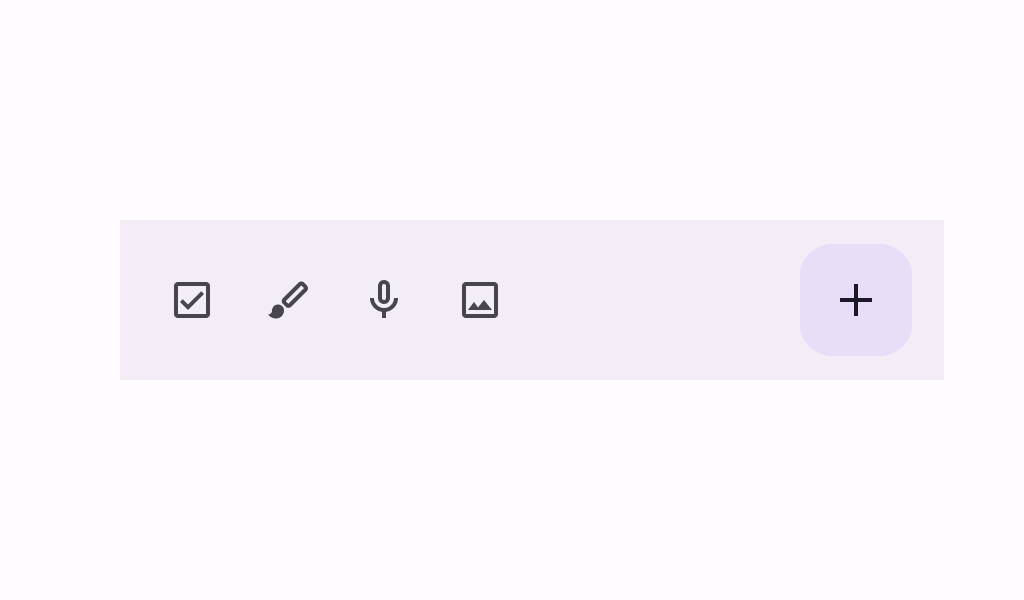
SimpleBottomAppBar
@Composable
@Sampled
@Preview
fun SimpleBottomAppBar() {
    BottomAppBar(
        actions = {
            IconButton(onClick = { /* doSomething() */ }) {
                Icon(Icons.Filled.Menu, contentDescription = "Localized description")
            }
        }
    )
}
BottomAppBarWithFAB
@Composable
@Sampled
@Preview
fun BottomAppBarWithFAB() {
    BottomAppBar(
        actions = {
            IconButton(onClick = { /* doSomething() */ }) {
                Icon(Icons.Filled.Check, contentDescription = "Localized description")
            }
            IconButton(onClick = { /* doSomething() */ }) {
                Icon(
                    Icons.Filled.Edit,
                    contentDescription = "Localized description",
                )
            }
        },
        floatingActionButton = {
            FloatingActionButton(
                onClick = { /* do something */ },
                containerColor = BottomAppBarDefaults.bottomAppBarFabColor,
                elevation = FloatingActionButtonDefaults.bottomAppBarFabElevation()
            ) {
                Icon(Icons.Filled.Add, "Localized description")
            }
        }
    )
}
ExitAlwaysBottomAppBar
@Composable
@Sampled
@Preview
@OptIn(ExperimentalMaterial3Api::class
fun ExitAlwaysBottomAppBar() {
    val scrollBehavior = BottomAppBarDefaults.exitAlwaysScrollBehavior()
    Scaffold(
        modifier = Modifier.nestedScroll(scrollBehavior.nestedScrollConnection),
        bottomBar = {
            BottomAppBar(
                actions = {
                    IconButton(onClick = { /* doSomething() */ }) {
                        Icon(Icons.Filled.Check, contentDescription = "Localized description")
                    }
                    IconButton(onClick = { /* doSomething() */ }) {
                        Icon(Icons.Filled.Edit, contentDescription = "Localized description")
                    }
                },
                scrollBehavior = scrollBehavior
            )
        },
        floatingActionButton = {
            FloatingActionButton(
                modifier = Modifier.offset(y = 4.dp),
                onClick = { /* do something */ },
                containerColor = BottomAppBarDefaults.bottomAppBarFabColor,
                elevation = FloatingActionButtonDefaults.bottomAppBarFabElevation()
            ) {
                Icon(Icons.Filled.Add, "Localized description")
            }
        },
        floatingActionButtonPosition = FabPosition.EndOverlay,
        content = { innerPadding ->
            LazyColumn(
                contentPadding = innerPadding,
                verticalArrangement = Arrangement.spacedBy(8.dp)
            ) {
                val list = (0..75).map { it.toString() }
                items(count = list.size) {
                    Text(
                        text = list[it],
                        style = MaterialTheme.typography.bodyLarge,
                        modifier = Modifier.fillMaxWidth().padding(horizontal = 16.dp)
                    )
                }
            }
        }
    )
}
